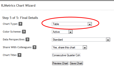
Today, we expanded our data display options to include raw tabular data. Simply choose “Table” from the list of charting options and you’ll be able to view the raw data behind any chart in tabular form right in your RJMetrics dashboard:
The tabular output provides an easy way to view the raw data powering your charts (and you can still always export to CSV or Excel).
Like all other charts, tabular data sets can be enlarged by clicking the “Enlarge” button beneath the chart. This will provide an expanded view, making large data set exploration easier than ever with RJMetrics.


