Over the past four months I have improved RJMetrics’ landing page conversion rates by as much as 74.9% and increased click through rates on our homepage by 88.2%. Pretty impressive, right? Truth is, I wasn’t always a conversion optimizer. Here’s how I went from a testing newbie to a conversion rate optimization beast.
How I learned my baby was ugly
One of my first tasks at RJMetrics involved building a new landing page. With a furrowed brow, I slaved over my Photoshop file, overhauling the textured backgrounds with flat colors and concentrated on inching images just a fewww more pixels to left. Proudly, I unveiled my baby to our designer, received the stamp of approval, and began coding.
My beautiful page was live! I rode this fantastic high for a few days until we realized that my amazing design had the amazing conversion rate of…zero. Yep, the landing page I had given my all, created with my own blood, sweat, and tears was a total failure. There was no denying it, the world thought my baby was ugly.
It’s really not the landing page was so terrible, but here’s the thing – landing pages, emails, and all forms of digital marketing must take on the difficult task of being both the beauty and the brains Tweet This!. In addition to looking great, a landing page has to convert visitors into leads. Mine clearly wasn’t doing so well on the latter.
I made the same mistake that many companies make. I wasn’t turning to the right people to help me create better landing pages. Instead of expecting our designer to know what a high-converting page looks like, I should have been looking to our visitors – they are any companies’ best source for information on what converts.
Every single person that comes to your site has an opinion about what they like. Visitors need to be wooed and treated the right way before they commit to a signup or a purchase. As potential suitors, it is up to the company to listen to their needs and give them what they want. It’s not the designers’ job to be a mind reader. It was up to me to take this courtship to the next level. It was time to start using data.
The power of the A/B test
One of my favorite tools for gauging what our visitors want is through A/B Testing. Its name should give a big hint to how it works. In an A/B Test, you are directly evaluating two different versions (A and B) of an element for a period of time to see which one is more successful. To determine which version works better, you split traffic to the page and all versions are shown in parallel to each other. In most cases, version A is the existing version of your landing page, the control. Version B is the new design you would want to test.
Since immersing myself in this process, I have run multiple tests with Optimizely, an online A/B testing tool, that have come up some pretty interesting results. Here’s what I’ve learned.
Testing Image Placement
When I initially started dipping my toes into landing page A/B testing, I was testing simple and typical A/B test changes without fully flushed out predictions behind why these tests could work. While this helped me get comfortable in the world of testing, it also leads to less impactful results. To get big results with A/B testing, you have to be clear about what and why you’re testing Tweet This!. This test was one of the first experiments sparked by a clear question and a solid hypothesis.
Here’s how our eCommerce Metrics landing page looked:
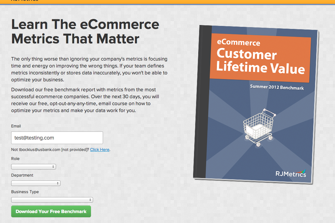
It was a basic 2-column layout with a description of our benchmark report and form on the left and a cover image to the right. My hypothesis was that since people read the English language from left to right, I could spark more interest if I showed them the image first then asked them to do the reading. For the first variation, I swapped the text and image, moving the image to the left.
Here’s how the B test looked:
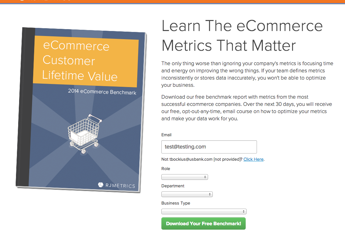
Within a few days the results were in. With 99.5% confidence I could say that Test B improved conversion rates by 75.9%. Now that’s a baby to be proud of.
Lesson Learned: create designs that work with people’s normal habits and behaviors.
Testing Button Placement
Getting the pricing page right is critical for SaaS businesses. Here is what we were working with originally:
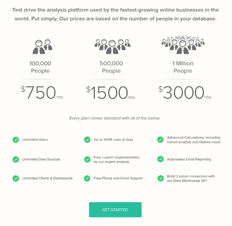
We wanted to test a completely new variation that included an input section where the user could type in the number of customers their company has and our website would return the appropriate pricing option for them:
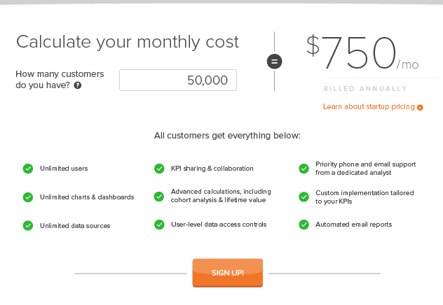
While the new design got a substantial amount of people using the input section, it was getting fewer people to actually click the sign up button as compared to the original pricing page – not good. I needed to find a way to get people to not only input their options, but to also convert.
I had integrated the initial test with CrazyEgg. This made it easy to go back to our scroll maps of the experiment to analyze what possibly went wrong. Here’s what I saw:
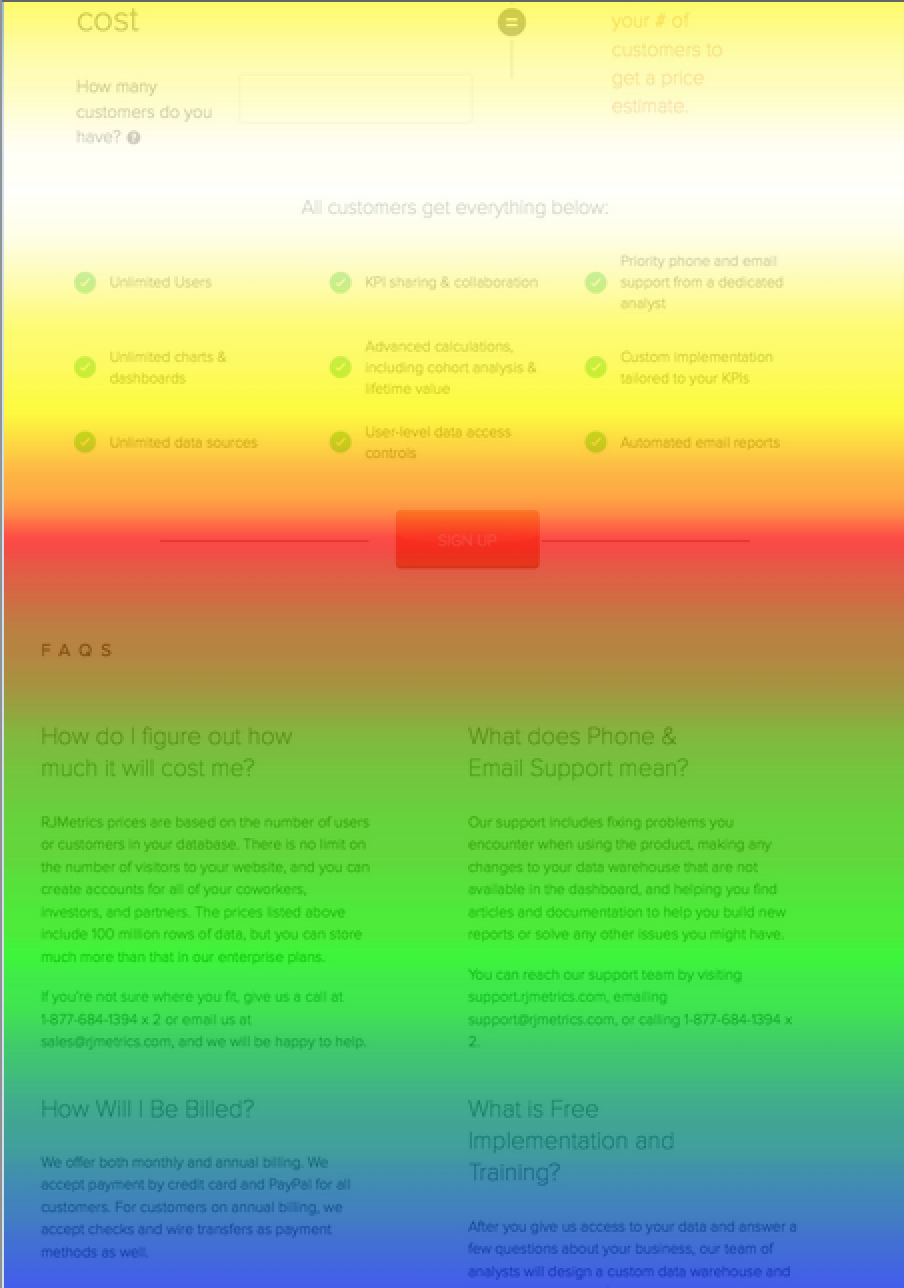
Scroll maps work in such a way that the “hotter” zones are the sections where users spend the most time while the “cooler” areas are the parts of the page users scroll quickly past. On our new design, the call-to-action (CTA) button could definitely use some warming up.
My hypothesis was that moving the button into the white hot scroll map area would cause the design to have a higher conversion rate as compared to the original pricing page. More people would pay attention to the button simply because their eyes would be lingering there longer.
I was expecting this to have a slight impact, but nothing major. I know that when I visit a website’s pricing page, I am usually very thorough with reading all the content on the page before I commit to clicking a “sign up” button. I didn’t think that placing a button in the midst of all the details would spur me to want to click it any more than placing it right beneath the important content, but I was willing to give it a try.
Here’s the variation I tested:
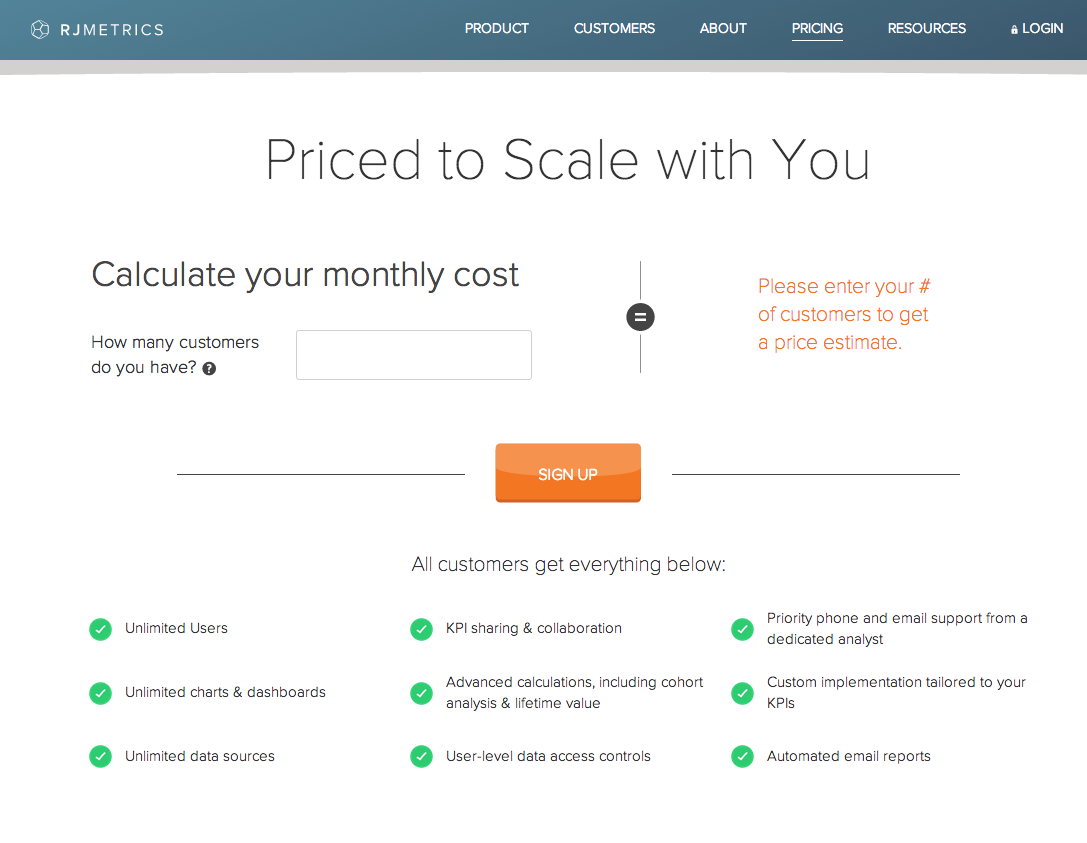
I was doubtful of how effective it would be to tweak a design that had been previously tested, and failed. Imagine my surprise when the the results come back with a 310% increase in conversion rate.
Lesson learned: always test your assumptions. Tweet This!
Testing Copy
Our previous homepage listed three case studies with wordy descriptions next to them. The case studies are fantastic, but not many people were clicking on them to read the full story. My hypothesis was that the detailed descriptions were reducing motivation to click through to a specific case study.
Here’s how the original page looked:
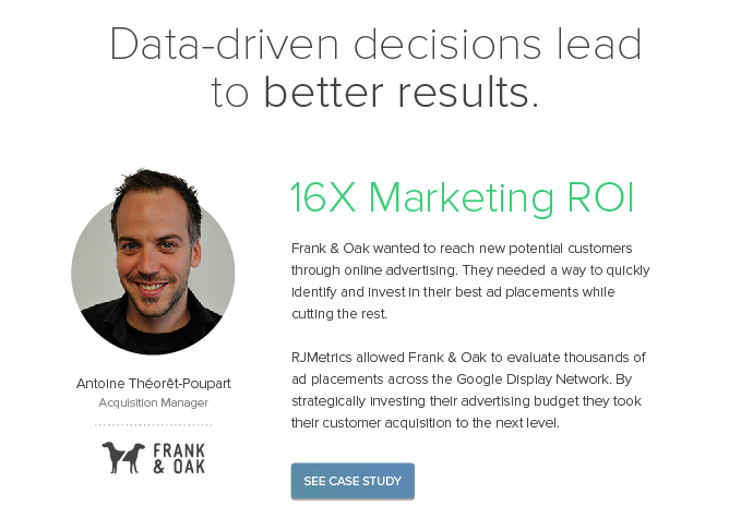
By removing those descriptions, I hoped to increase the amount of traffic to those pages with a statistical confidence of at least 95%. For the variation, I kept only the green titles and removed the descriptions entirely:
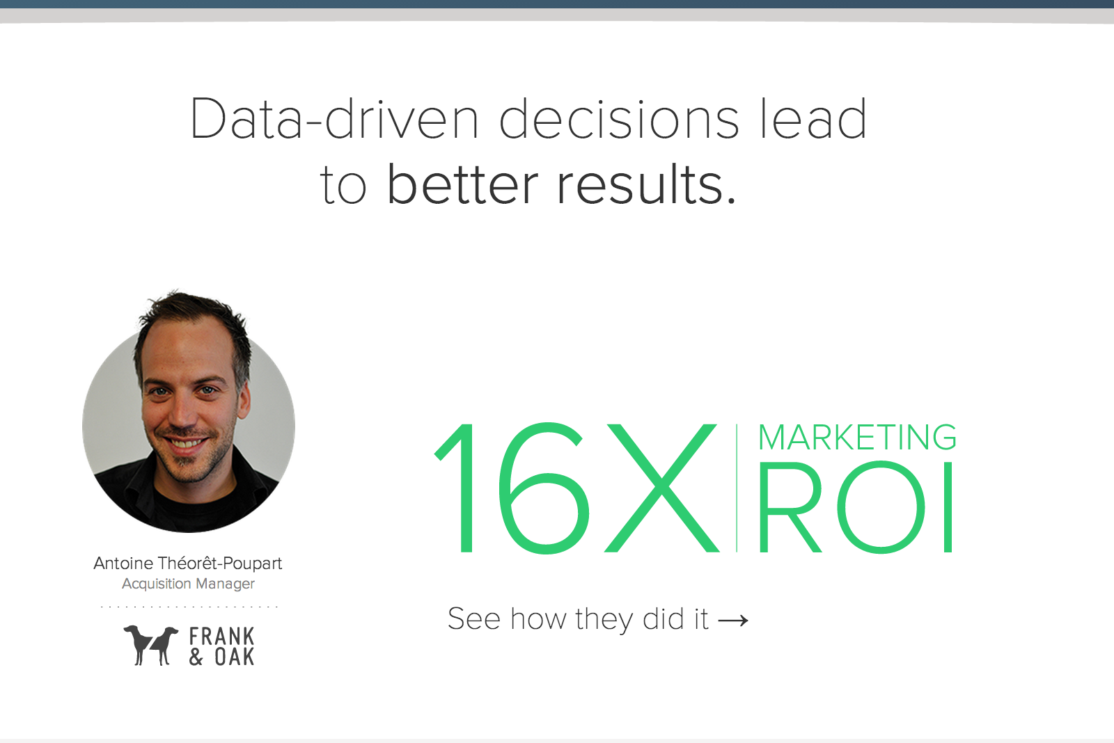
My hypothesis was spot on. Focusing on sparking curiosity, rather than adding additional descriptions, boosted the click-through rate by 88.2%.
Lesson learned: don’t oversell and always leave people wanting more.
Wrapping up
There it is, that’s how I improved RJMetrics’ landing page conversion rates by as much as 74.9% and increased click through rates on our homepage by 88.2%. Even through this small number of experiments, the value of using data in web design is undeniable. Just because a landing page looks fantastic, does not mean it would function well in terms of conversion. So test, test, test. Make thorough use of the amazing landing page expert panel that is your visitors. Because, remember, young grasshopper, without data, it’s just an opinion. TweetThis!
