[This article was also featured as a guest post on TechCrunch on October 5th, 2009.]
A few weeks ago, my former employer led a $100 million investment into Twitter and I must admit that I was quite jealous of my former colleagues. Chances are they got the opportunity to do some very cool analytics on Twitter’s data.
Rather than wonder about what I missed, I decided to figure out what I could from the outside looking in. Using some statistical trickery, the Twitter API, and my RJMetrics dashboard, I uncovered a ton of astonishing new information about Twitter. Here are some highlights:
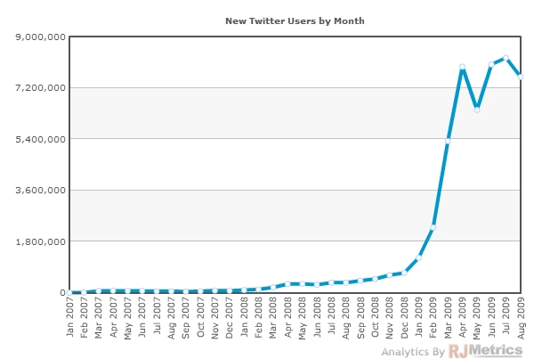
- Twitter’s user growth is no longer accelerating. The rate of new user acquisition has plateaued at around 8 million per month.
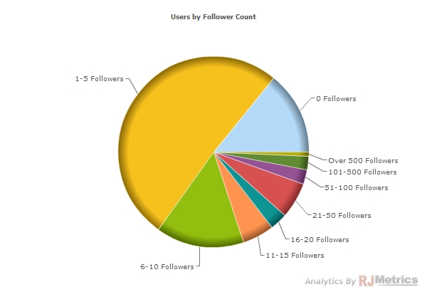
- Over 14% of users don’t have a single follower, and over 75% of users have 10 or fewer followers.
- 38% of users have never sent a single tweet, and over 75% of users have sent fewer than 10 tweets.
- 1 in 4 registered users tweets in any given month.
- Once a user has tweeted once, there is a 65% chance that they will tweet again. After that second tweet, however, the chance of a third tweet goes up to 81%.
- If someone is still tweeting in their second week as a user, it is extremely likely that they will remain on Twitter as a long-term user.
- Users who joined in more recent months are less likely to stop using the service and more likely to tweet more often than users from the past.
Read on for some detailed charts a deeper dive into the data.
How We Did It
In most cases, this kind of outside-looking-in exercise wouldn’t be possible. Twitter, however, is a special case for a few reasons:
- The company is pre-revenue, so its value is wrapped up in user activity and engagement
- A Twitter user’s activity data (tweets, followers, etc) is all public by default
- Twitter’s API allowed me to automatically download up to 20,000 data points per hour
- Twitter uses auto-incrementing ID numbers (1,2,3,4…) for both users and tweets
- The central limit theorem tells us, among other things, that a large enough random subset of a large data set will behave like its parent set with a high degree of statistical confidence
In the end, our sample size consisted of about 85,000 users and just over 3 Million tweets. By piecing all of these things together and pulling the data into the RJMetrics Dashboard, I was able to chart loads of information about Twitter’s user base and user behavior. I’ve looked around, and this appears to be the largest public analysis of Twitter’s user base online. Enjoy!
Number of Twitter Users
This analysis leverages the fact that Twitter uses auto-incrementing ID numbers for both users and tweets. We identified the range of IDs that were consumed by the system in any given month and the percentage of them actually tied to real Twitter accounts. (“Dead” IDs are likely canceled accounts, SPAM accounts, test accounts, etc.) In combination, these numbers give us a reliable approximation of how many new users joined Twitter each month:
This shows us the exponential growth experienced by Twitter in 2009. In Q3, this plateaus at a rate of about 8 million new users per month. A chart of total cumulative users is below:
Hockey, anyone? As of September 1st, the actual number of live Twitter accounts was just above 50 million.
Average Number of Followers
According to the data, the average Twitter user has 42 followers. It’s interesting to see the distribution of users by the number of people following them:
As you can see, the vast majority of users have ten or fewer followers, and over 20% have no followers at all! As we know, most users have been on the system for less than a year and, as shown in the chart below, the number of followers is proportional to the user’s time since joining:
Number of Tweets
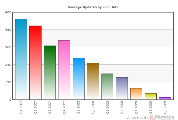
It’s also interesting to look at the number of status updates, or “tweets” made by the average user. Obviously, the number of tweets from any given user grows over time (per the trend shown in the chart below):
When we look at the distribution of tweets by user, we see a very surprising trend: over 75% of all Twitter users have tweeted fewer than ten times.
“Protected” (Private) Twitter Profiles
Before moving onto analyses at the tweet level, it’s important to note that some of the users we identified have “protected” their tweets, meaning we were able to see how many followers they had and how many times they had tweeted, but were unable to download specific tweets (and, more importantly, tweet times).
The chart below shows how many users in our data set are “protected” by the month they joined. The overall number sits around 10% (and dropping):
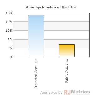
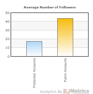
Also interesting is how “protected” Twitter users differ from public users. As shown in the charts below, protected users tend to tweet far more often, but have far fewer followers:
Power Users
Another limitation of the API is that it can only return the 3,200 most recent tweets for any given user. This is obviously not a big deal for most users, but there are some users out there who have passed that mark. Our sample data set showed that less than 0.02% of Twitter users have sent more than 3,200 tweets. These users will have incomplete data sets in our study, but the population is so small that they should not have any meaningful impact on our conclusions.
Tweets by Source
It’s interesting to see how different tweeting methods have risen up over time. Below I show the most popular methods and what percent of Twitter traffic came through them each month since 2007:
The web clearly dominates this list. Let’s exclude it to get a closer look at which other sources are driving tweets:
Twitterriffic has clearly seen better days, and text messages (txt) have been declining as a channel, as well. Meanwhile, TweetDeck appears to be aggressively gobbling up market share.
Time Between Tweets
Since we know the timestamp of every tweet in our sample data set, we can study the time between tweets and the recency of tweets from the userbase.
Remarkably, the average time between any two tweets from the same user is exactly 24 hours.
The chart below shows the average amount of time between tweets for a user’s first ten tweets (when applicable). The x-axis contains the time of the tweet in question, and the value is the average amount of time since the previous tweet.
Surprisingly, the time between Tweets actually drops as users do more tweeting. However, this could be biased by the fact that most users have tweeted fewer than ten times. To clear things up, let’s look at the average time between tweets based on how many times the user has tweeted:
Indeed, as you might expect, users who send more tweets also tweet more frequently, and the dropoff is quite significant.
Probability of Incremental Tweets
Since there is such a huge dropoff in tweeting activity up until the 10 tweets mark, we thought it might be interesting to look at the “probability of an incremental tweet” based on how many tweets a given user has completed. This can be calculated with just a few clicks in RJMetrics:
As you might expect, with every Tweet a user performs, their chance of tweeting again goes up.
Active Tweeters
We know that Twitter has 50 million registered users, but we also know that the vast majority of them have tweeted fewer than ten times. Let’s investigate just how many of these registered users are actually actively tweeting.
Using our tweet data, we can identify what percent of the user base sent out at least one tweet in any given month. This “unique tweeters” statistic is charted below (to get a fair statistic we excluded protected accounts from our denominator):
The number seems to hover in the 25% range. In other words, only about 1 in 4 registered users is actually tweeting in any given month. (Although it’s worth noting that some users may only be using Twitter to read others’ tweets, meaning they are not full-fledged “zombie” accounts.)
Notice the bump in early 2009, right around the time when new user growth began to accelerate aggressively. This suggests the obvious: on average, a newer user is more likely to tweet than an older user. When new user growth exploded in early 2009, the concentration of new users became denser, driving this average up. To illustrate this (and get a better look at how users behave over their lifetime), we turn to cohort analysis.
Cohort Analysis
A cohort analysis is a great way to look at user behavior and loyalty over time. Each line in the chart below represents a different “cohort” of Twitter users based on the month they joined (we chose 7 cohorts from different time periods to avoid clutter). In the chart below, we monitor what percent of the users in each cohort come back to tweet again in each month after having tweeted in the first month. Obviously, month 1 is 100% by definition:
This is quite a telling chart:
- There is an expected usage dropoff in month 2, but after that point usage holds predictably steady. This is great news for anyone trying to forecast user activity early on in a new user’s lifetime.
- The newer cohorts, despite being significantly larger in size, actually consist of more loyal users. The two highest lines are also the two most recent, meaning that users who joined in 2009 are actually more likely to keep tweeting after their first month than those who joined in the same month in 2008.
Since the dropoff in Month 2 is quite pronounced, let’s zoom in and look at weekly cohorts to see if we can see how usage drops off at the weekly level:
We see a similar pattern here, although more recent cohorts don’t stand out as much as in the monthly analysis. Again, however, the dropoff in the second period doesn’t seem to further decline as time goes on. This means that by the second week of a cohort’s lifetime, Twitter can reliably predict its users’ future behavior as a group.
Another cohort analysis that might be interesting is to look at how many tweets a cohort makes each month after joining. This metric will incorporate both the dropoff in usage from the users who churn in the first month and the uptick in activity from users who stay on the platform:
Wow! This is a remarkable image. Despite the massive dropoff in users after the first month, the tweeting activity from the users who are left is so voluminous that it makes the “tweets per month” of each cohort average over 100% (and, as before, the more recent cohorts are the more loyal)!
In other words, the users who stick around actually tweet so frequently (and at such a rapid pace compared to their first month) that they more than make up for the lost activity of those who churned after the first month. This is a very powerful and unexpected statistic.
Conclusion
Everyone has their own feelings about Twitter’s reported $1 billion valuation. I hope this article gave you a taste of what its new investors likely considered before coming up with that number.
To learn more about RJMetrics and our original blog posts including the business intelligence rap and our twitter followers guide, check out our website and follow us on Twitter @RJMetrics.

