Today, we are happy to highlight another great RJMetrics feature: the ability to study the “Time Between Events” for any timestamped records within your company’s data set. This feature can be used to perform a number of valuable analyses, including:
- Studying how engagement (spending, usage, etc) varies based on different customer attributes.
- Improving forecasting by identifying an expected time between repeat purchases.
- Studying how certain factors (number of purchases, behavioral tendencies, geography) may impact customer or user engagement.
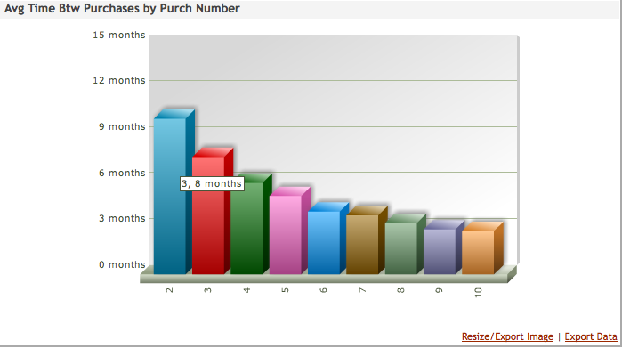
In the following example, we profile the famous fictional company, Vandelay Industries. We chose the trend “Average Time Between Purchases” (in step 1) and grouped by customer purchase number (in step 3). This resulted in the output below:
Here, we can see that the time between purchases decreases notably with each incremental purchase. This means that, while it may take 10 months for the average customer to make her second purchase, it only takes 8 months for her to come back and make a third. By the time the average customer has made her tenth purchase, that delay is down to just two months! (Of course, as you can see in other charts, the number of customers that make that many purchases is quite small as a percentage of the entire base.) As with all RJMetrics charts, you can scroll over each data point to see the underlying value, and you can always export the data to Excel or CSV (when exporting time data to Excel all values are shown in seconds to provide the greatest possible granularity). If you’re interested in learning more about RJMetrics, check out our website where you can learn more and try out a free demo.

