Since rolling out SVG charts in March, we’ve been hard at work optimizing our visualizations.
Stacked Charts
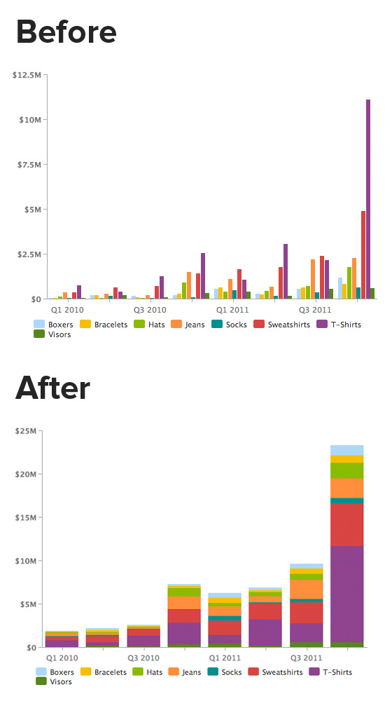
A feature that’s been pretty heavily requested is the ability to create stacked column charts. You spoke, we listened.
Better Labels
You may have also noticed that we’ve made our date formats smaller, truncated really long category names and abbreviated numbers ($1,000 => $1K, $1,000,000 => $1M). We wanted to increase our data-to-ink ratio, and found these to be the lowest hanging fruit.
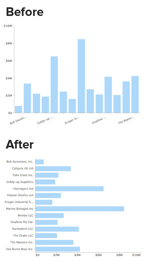
We noticed that there were charts that had categories on the x-axis that were really long and required you to cock your head to the side just to read them. No more. To combat this, we rotated the x-axis so labels could be given more space and be more readable.
Some charts, however, will still remain vertical columns. These include repeat event probability charts and column charts over time. These don’t suffer from long x-axis labels, and are more understandable as vertical columns than as horizontal bars.
We have loads more coming. The most exciting stuff is only a couple of months away. Stay tuned.


