Averages, as any introductory statistics teacher will tell you, are dangerous. It’s easy to average the churn rates of 100 customers and come up with a single number. For example, it is easy to determine that in the past month 5 customers out of 100 cancelled, for a churn of 5%. But what if it turns out that 3 of those customers had just started a month ago, and the other two were still in the first 6 months of their subscriptions?

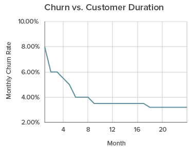
In this case, looking at a 5% average churn doesn’t help us diagnose the real problem. Let’s look at a chart that compares customers by the number of months since activation, instead of by date.
The chart on the right makes the problem blatantly obvious. This company is having huge churn problems in the initial 6-8 months of a customer’s account, but after that things are settling out to a reasonable 3.5%.
This is a very specific problem: customer activation. Customers are signing up and paying, but are never getting fully “activated” and dropping off, unsatisfied. Your longer-term customers, the ones who are successfully using your product, seem to be happy campers.
What can churn rate and cohort analysis uncover?
This is only one example of the secrets uncovered by looking at churn rate and cohort analysis. Some companies find that their customers love the product initially but quickly outgrow it and move on to more sophisticated up-market competitors. Other companies find that their product is implemented on a project basis, and once the product is complete, usually in 4-12 months, churn spikes. The only way to know the answer for your business is to do the analysis.
The technical term for this is churn cohort analysis. It compares your entire subscription base on when they started service and shows where the major attrition events occur. Cohort analysis is an amazing tool to uncover hidden trends in your business. Learn more here.

