Our marketing toolkit at RJMetrics includes a handful of microsites—one-page sites that exist outside of our company’s primary marketing website. We love them for lots of reasons: they’re quick to make, they’re inexpensive, and they offer a simple, straightforward platform for engaging new audiences.
Our microsites are highly focused. Each one takes on a single question that our prospects want to know about and answers it in a creative but digestible way. The benefit to us is clear: if we do a great job showing, for example, why keeping a low churn rate is critical to a company’s success, we’re in a much better place to start making the case for the utility of an analytics platform like RJMetrics.
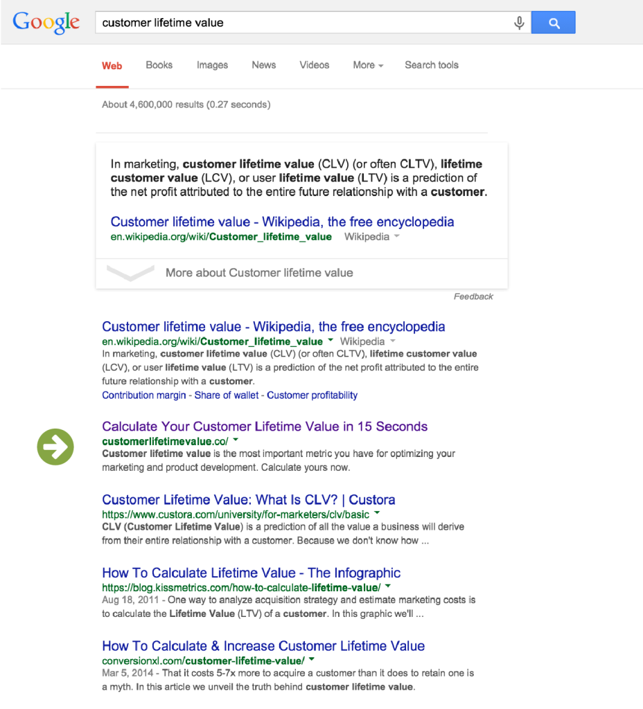
Over the past few years we’ve launched several microsites in a variety of styles — from the bare-bones cohortanalysis.com to the zany customerlifetimevalue.com. These microsites have historically been a major content marketing win: they attract plenty of traffic and have helped us achieve some pretty impressive SEO results. See that “Calculate Your Customer Lifetime Value in 15 Seconds” link below? That’s us, ranking for the term “customer lifetime value” and second only to Wikipedia:
But in spite of the great SEO rankings, the traffic wasn’t resulting in new leads. Across our three top-performing microsites, less than 1% of visitors were starting a trial of our product. We were educating an audience, but not converting them. And we felt we could do better.
Churn-rate.com: a case-study in conversion optimization
As a graphic and web designer here at RJMetrics, I was tasked with redesigning one of our longest-running microsites: churn-rate.com. This was a new kind of project for me. I’d been designing web content for years, but never with an explicit focus on conversions. I had only just begun to learn the basics of A/B testing and CRO, so a full-page redesign felt a little like jumping into the deep end. I wanted to be sure that I was making the right design decisions. So before I touched anything in Photoshop, I set up an RJMetrics dashboard to track key performance indicators for all our microsites. Now that I could see immediately how any changes I made were affecting unique visitors, leads, and conversion rates, I was ready to begin my redesign.
My strategy for improving churn-rate.com’s performance was two-pronged:
- Come up with a more engaging design
- Capitalize on that engagement with a well-timed CTA (the current site had a free trial offer, but it was all the way at the bottom)
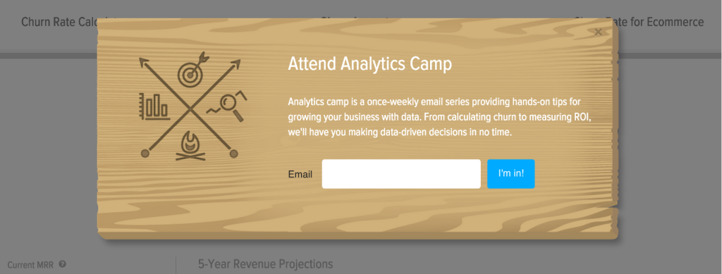
To that end, I revamped the look of the site, making it brighter and more playful, and added a set of interactive calculators. I kept the free trial offer at the end, but added something new: when a visitor started tinkering with a calculator on the updated site, it triggered a modal which delivered a CTA to sign up for our Analytics Camp course:
Here’s what the site looked like before and after the changes:
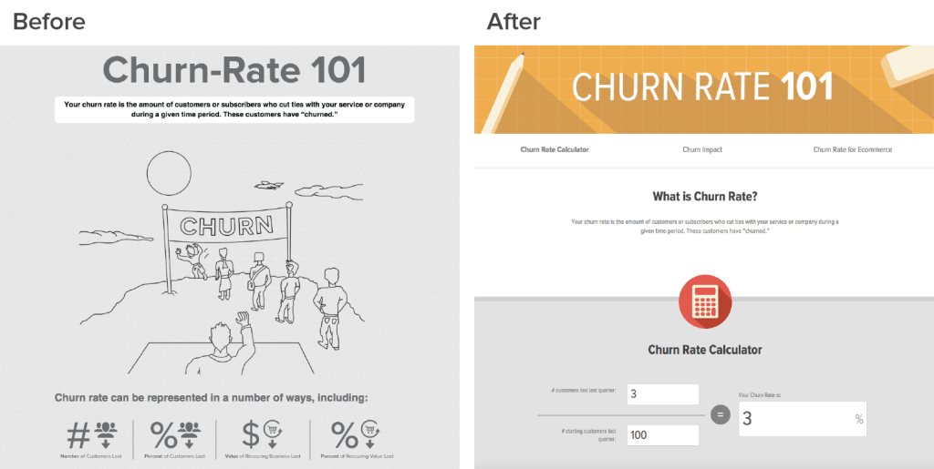
The “before” version certainly wasn’t winning any beauty contests. So I wasn’t surprised when the revamped site started performing better… but still, I wasn’t expecting this kind of results:
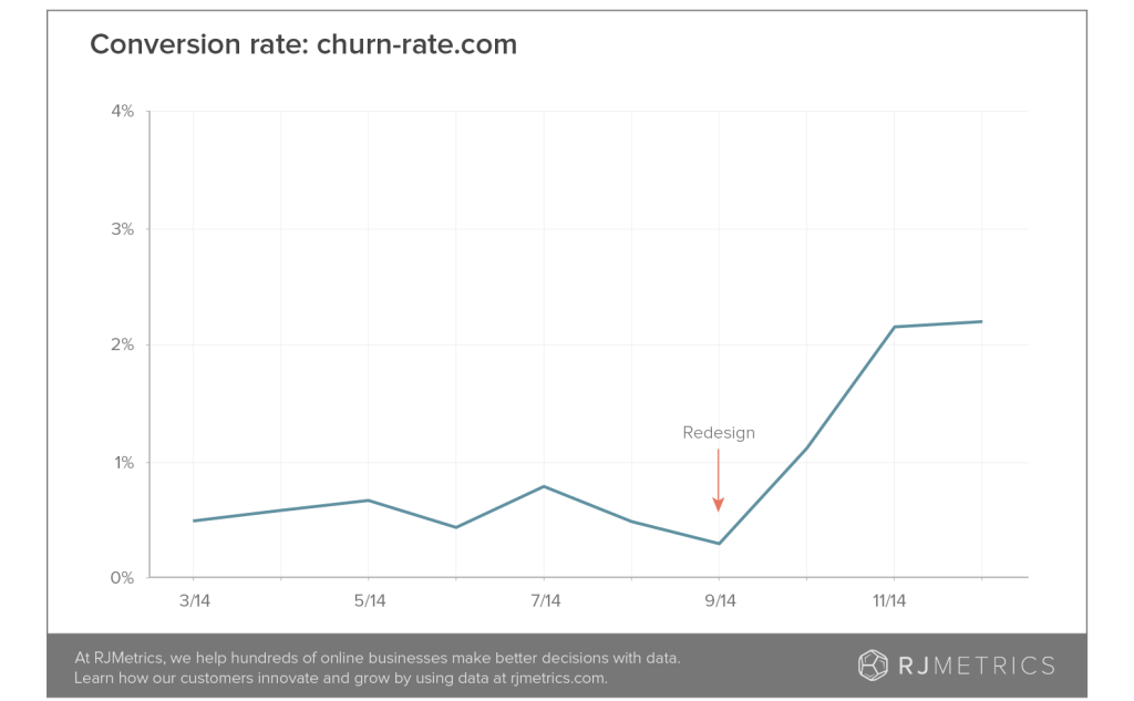
In the three months after the redesigned version launched, the churn-rate.com conversion rate tripled. Allow me to put this into some perspective. In the three months prior to the redesign and CTA addition, this site generated a total of 59 leads. In the three months following the redesign, it generated 217 leads. That’s 72 leads every month, a 278% increase! Also worth noting is that the three months following the redesign comprised the usual holiday lull. And it just kept getting better. In February, after some additional data-driven tweaking, we brought in 134 leads from this site.
I know what you’re thinking: “This seems too good to be true. I bet these leads are garbage.” Great question! But they’re not. I’m not going to share exact lead to qualification to customer numbers, but trust me when I tell you this, they’re good. And at the end of this post, I’m going to explain a little more about why I think that is.
So what was it? The new design or the CTA?
Bolstered by this astonishing success, I thought, what the hell. What if I save myself the work of a redesign and just add the new CTA to the rest of our microsites? And that’s where things got really interesting:
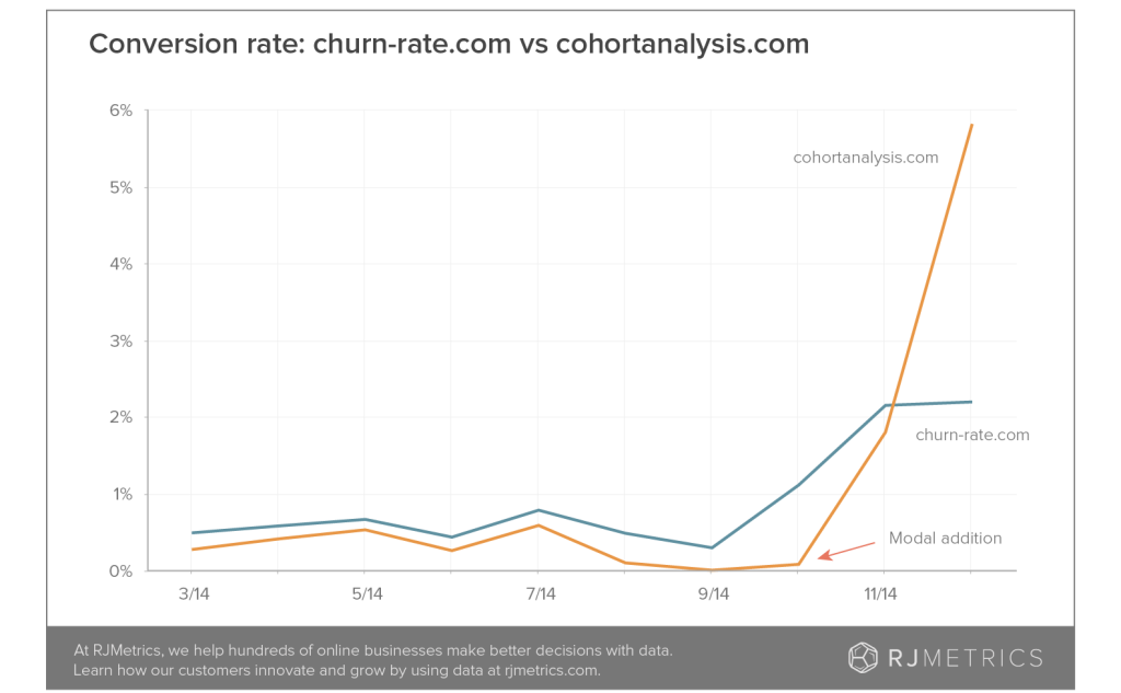
This chart shows the conversion rates for our two most trafficked microsites: churn-rate.com (the one I had just redesigned) and cohortanalysis.com (another older site, still in its original form). In October 2014, I added a CTA modal to the cohort-analysis microsite, but did no additional redesigning. And it immediately started converting at nearly 6%. In the three months prior, cohort-analysis had generated 14 leads. In the three months after, it generated 631 leads! That’s a 441% increase. Keep in mind, these are completely free, qualified leads. We’re not paying to drive traffic to the site, we’re just capitalizing on the existing demand.
But the real story here is that the site I simply slapped a CTA on was doing three times better than the site I spent hours redesigning. What?! Without my microsites dashboard, I never would have noticed the the extreme differences in conversion rates for these two sites. So, what was going on here?
There was one key difference between the churn-rate modal and the superior cohort analysis version: on the latter, a user simply had to scroll down the page far enough and the modal would appear. On the former, we were delaying that modal until a user had interacted with a calculator. It just wasn’t getting in front of the same percentage of eyeballs. The modal trigger was an easy change to make, so we changed it. And once more, we saw a big improvement: conversions on churn-rate more than doubled again.
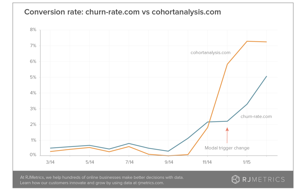
The gap had narrowed, but cohort-analysis.com continued to outperform with its plainer design. And so my hypothesizing continued.
Becoming a data-driven designer
In our marketing department we have a poster listing Dieter Rams’s 10 Principles of Good Design. (They’re meant to apply to physical product design, but translate beautifully to digital spaces.) The final principle is this: Good design is as little design as possible. Yes, my redesign was fun and it looked good. The site weaved together icons and illustrations and a punchy color pallette. But I had to ask myself, was it necessary? Or were the frills getting in the way of what our user wanted to do (in this case, research a business concept)?
A look at the data I’ve collected does seem to support the hypothesis that simpler is better. Of our 3 main microsites, the most visually complex site, customerlifetimevalue.co, is performing the worst. Perhaps my modal converts at its best possible rate when it’s paired with a very minimalist design. It could be that when the design of a site is competing with its CTA for attention, performance suffers.
With this insight in mind, my next step is to test a simpler microsite template—a version that includes all the best practices we’re gathering. I’ll keep our modal and interactive tools, but trade in some of the flashier graphics for a less complicated visual style. And then I’ll see what my microsites dashboard has to tell me.
4 steps for creating a lead-generating microsite
Turning these sites into lead-generating machines has been an incredible win for us. And, as promised, here are a few tips for how you can get started replicating this success.
Pick a topic that has high search volume
Even a site that converts well is going to need a lot of eyeballs to generate a worthwhile number of leads. Make sure that you’re building a site that has utility for your prospects. Do your keyword research.
Develop the right content
The key here is to be useful and clear. Explain the importance of your search term in a straightforward way. Include interactive tools if they help educate a user, but don’t over complicate things. There are services to help you with this – SnapApp, for example, can quickly create simple tools and quizzes from your existing content.
Match it with the right CTA
Our users were searching for information about business metrics, but they weren’t ready to jump right into a trial of our analytics platform. The Analytics Camp CTA was the perfect match for the content they were reading, inviting them to continue learning more about a topic we know they’re interested in.
Keep your design simple
Your microsite doesn’t have to look like a work of art. In fact, it might be better if it doesn’t! Remember, your job as a designer isn’t to create the fanciest or most impressive thing, but the best thing. The thing that has the greatest chance of achieving the goal you’ve set. Keep focused on whether you’re accomplishing this, and you’ll be on the right track.
It All Comes Back to Data
The above tips are a great starting point, but if you really want to build successful microsites, you need to keep an eye on your data. If not for my near-obsessive dashboard checking, I might have spent a lot of time on multiple redesigns that inadvertently generated fewer leads. Being able to see the data helped me quickly learn what was working. And that’s why my dashboard just might be my new favorite design tool.