In January of this year we decided it was time to update the email template for our promotional emails. According to Mailchimp’s benchmarks, the average click-through-rate (CTR) for our industry is 2.65%. We had been focusing our optimization efforts on CTR vs. open rates because almost every single email we send requests the reader to take an action (click), making this metric better for us than open rates alone. Across all of our email sends we were coming in around 3%, so slightly better than average, but nothing to get too excited about.
We had been running a variety of email tests prior to January 2015. We tested timing (little impact), senders (to see if a more senior person got a better response…they didn’t), button placement, and text. Nothing we had tried was making the kind of impact we really wanted to see.
Our template was looking a little stale and we figured a refresh would be sure to boost CTR. Of course, this is easier said than done. Building a new email template is actually an enormous pain. It takes designer time, not to mention a significant amount of front-end dev time to code, test, and then work out all the weird glitches that come with rendering on 37 clients, many of which predate modern web standards. Tables, anyone?
We’re a data-driven marketing team so naturally we thought, hey, before we undertake this enormous time suck of a project, let’s see if people actually like well-designed email templates.
The Tests
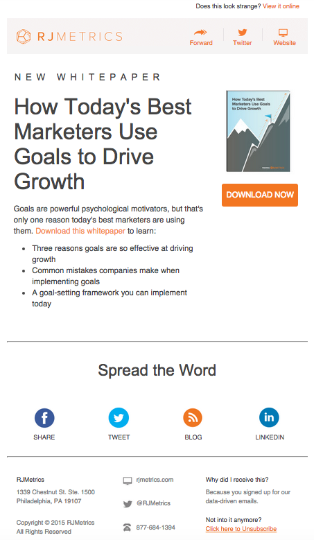
We were about to send out a promotion for a new whitepaper so we decided to A/B test using our nice template version for Version A:
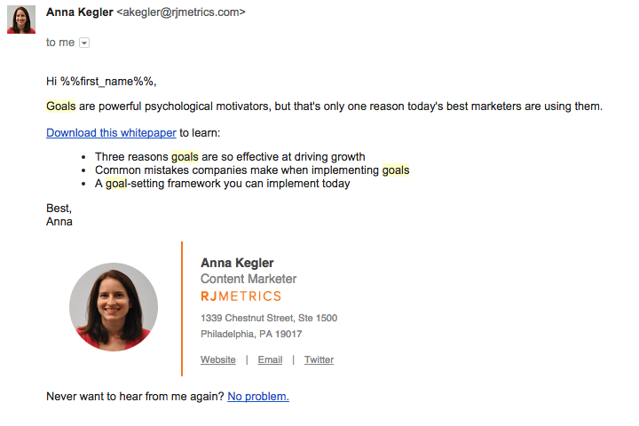
And then for Version B, we jotted down a quick note promoting the same piece of content. As you can see, this isn’t 100% plain-text. It still has HTML, just a much more pared down (and personal) version:
And here were the results:

What?! Nearly 2x as many people opened the email. Sure, we had set out to optimize for CTR, but an improvement in open rates of this kind translates into thousands of people seeing our emails that otherwise would have missed them. We had heard anecdotally that designed emails are more likely to end up in the promotions tab, but here was the actual evidence.
Mailchimp benchmarks say that a 22.03% Open Rate for our industry is normal, we just blew past that with a Unique Open Rate of 48.32%. This is the kind of “quick win” marketers dream about. In one swoop we doubled email performance, saved a day or more of design time, saved 15+ hours of dev time, and saved ourselves the 2-3 hours per email that it takes a marketer to do battle with the WYSIWYG editor.
We were thrilled! We were also very skeptical. It’s hard to accept data that is so directly contrary to what you thought was true. It’s hard to admit that all that time we put into thoughtfully designed emails was actually hurting email performance. So we tested this across our other promotional emails — online events for customers, online events for prospects, our customer newsletter, etc. By April, the only type of email that we hadn’t tested was our blog subscription email.
This was already a very clean email template, surely this wouldn’t really make a difference?
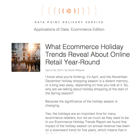
Here’s the designed version A:
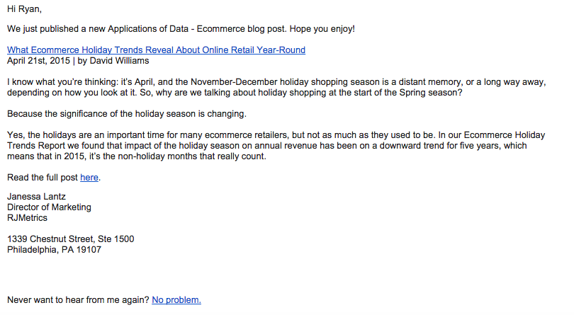
And the plain version B:
And the results:

Again, the open rates were significantly higher. For version A our Unique Open Rate was 21.55% , on par with Mailchimp benchmarks. For version B, Unique Open Rates jumped to 28.73%.
The results
To answer the question we started this post with: “How designed does your email template need to be?” — not much (if at all). The plain email advantage has remained consistent across all types of emails.
There’s a huge variation in both Open Rates and CTR based on the content of the email we’re sending, but we’ve seen our initial results maintain over the past few months and across emails. Today, our Open Rates are consistently better than Mailchimp benchmarks by 5 to up to 25 percentage points per email—that’s right, we’re often getting more than double the open rate of our industry average. And CTR is steadily increasing as well.
In January and February we saw CTRs of 3.74% and 3.80% respectively. Since then, we’ve maintained a monthly average of 4.86%. That’s almost double industry benchmarks. With a list of our size, this translates into thousands of additional people reading and taking action on our emails.
What does this mean?
We’re an unusually data-driven marketing team and pride ourselves on questioning assumptions and using data to override the status quo, but even we were susceptible to the herd mentality on this one. Every company out there is sending beautiful emails. Not every single one can be wrong…can they?
The data seems to indicate that…yeah…they might be.
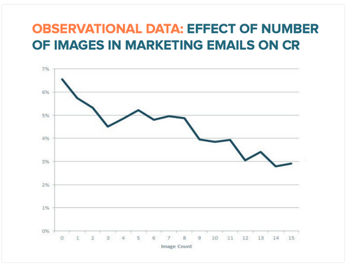
Hubspot recently published a post that backs up the exact findings we’ve been uncovering over the last few months. And they landed at a similar conclusion, you may not want to go 100% plain text just yet, but the number of images in an email is directly connected to a reduction in CTRs:
If you’re still sending fancy HTML email templates, it’s time to reconsider.
A final word of warning
Let me offer one word of warning before you make the switch.
We keep close tabs on our overall list subscribes and unsubscribes in RJMetrics. Anytime we see a spike in unsubscribes we know it’s time to rethink the volume or type of email we’re sending. You can see that in February when we started sending almost all of our emails using plainer templates we noticed an unsettling jump in unsubscribes:
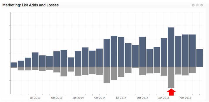
We believe this is because more of our emails were ending up in people’s primary inboxes instead of the promotions tab. People who had forgot they subscribed to our content, or no longer wanted to be, were suddenly exposed to us again and many of them unsubscribed.
We weren’t worried about this. I would rather have a list of engaged subscribers then sneak into someone’s promotion tab where they forget about us anyway, and it’s actually better for our overall sender reputation. This is just something to keep in mind if you try this for yourself. You’ll want to be prepared to explain to your boss why you just lost a big chunk of your subscribers and why this is actually a positive thing.
Learn more about email analysis
We’re currently Pardot customers, and while most of the testing for this post was conducted directly from the Pardot interface, we do a bunch of email analysis using the RJMetrics Pardot connector, which was just released into public beta last week. If you’re interested in doing more advanced analysis on top of your Pardot email data (like the chart above), you should probably join our upcoming webinar: How to Analyze Your Marketing Funnel Using Pardot + RJMetrics.
