You clicked! You’re reading! At this point you’re contributing to a number someone’s watching on a screen that looks something like this:
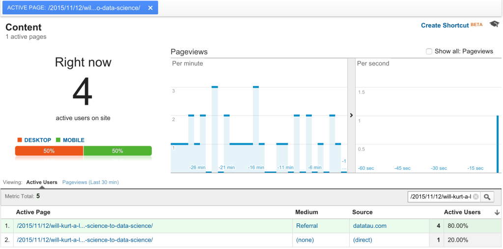
Most marketers are intimately familiar with the Google Analytics realtime interface because we’ve all (at one point or another) spent way too much time obsessing over it and watching those blue bars spike as people click to interact with our work.
Warning: engagement metrics are highly addictive. When you add in shares, click-through-rates, and forwards, you have the recipe for an afternoon spent congratulating (or hating) yourself. Next generation web metrics go even deeper, giving you insight on engagement metrics like mousemove, scroll, resize.
As you might guess coming from a data company, the RJMetrics marketing team loves this arsenal of metrics. We’re continually using them to determine how to improve the effectiveness of our content. This post is an adventure into that world. It’s fun, but please keep in mind, these metrics are dangerous because of their addictiveness! Only spend time and energy measuring engagement if you have a specific outcome in mind.
Our own case study
Last month, we released The State of Data Science, which was extremely successful – nearly 13,000 views and 1400+ social shares within the first month.
To give you a little context, this wasn’t our first benchmark, but it was one of the first reports we released as an interactive page on the web. These reports have historically been a major source of lead generation, and before the beginning of this year, we accomplished that by asking people to provide their email in exchange for a PDF download.
There were a few problems with PDFs:
- They don’t rank in search
- They aren’t easily shareable
- They are cumbersome to work with on our end
- They provide a less than ideal reading experience
- They collect no data on how people are interacting with content
Because of these reasons we made the decision to do away with PDFs in favor of putting the entire report on the web, gated only by a modal asking for an email address. That modal looks like this:
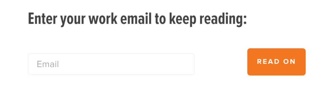
Yes, we do track conversion rate on this form, and that’s a really important metric. But for this case study we were interested in exploring data we couldn’t access before – engagement with the content. For this kind of page depth analysis you’ll need tools that are a little more sophisticated than Google Analytics.
The tools we used
For this kind of page depth analysis we use Snowplow, Amazon Redshift, and Mode. Snowplow tracks the number of unique engagement behaviors then it pushes all of this data into Redshift. Mode then sits on top of Redshift allowing us to run SQL queries on the data and create visualizations based on those queries.
That analysis software cocktail (plus some SQL) produced this chart, which separates users who did and did not enter their email, and how far they got on the page (the higher they are on the chart, the more they scrolled down).
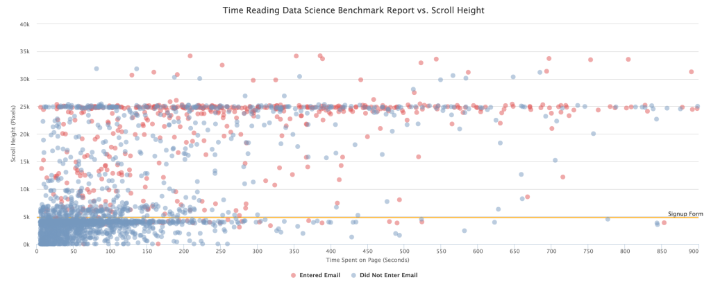
What can we determine from this data?
When analyzing this data, there are a few things you should know:
- The yellow line at the 5k mark is when the visitor is presented with the modal that requests their email address
- 25k is the end of the page for most users
- If a user returns to the page, they don’t need to enter their email address again, which is why you see blue dots above the signup form line
So, with this context, what can we tell from this graph? First and foremost, a lot of people are making it to the end of the page. We were excited to see this. The State of Data Science is a massive 4000-word report. In the world of “bite-sized content” we were pleased to see that readers were sticking with it to the end.
As with most web analytics, the takeaways here are mostly guideposts. Here are two things that jumped out to me.
- Form conversion. Conversion from landing on this page to entering email address isn’t superb (just over 16%). We think this has something to do with how people perceive the value of the content. A PDF still communicates “valuable research!” whereas a web page says something like “this is a blog post!” And requesting an email address on a blog post feels unfair. We might have some work to do there.
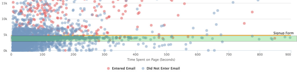
- Modal placement. If we move the modal farther down the page, my hypothesis is that we would get more people to give us their email address. They’ll get deeper into the content and realize that this is an in-depth report and feel less annoyed when we ask for an email address. This change would be focused on moving the users in green to above that orange line:
Further possibilities
Slicing data can be extremely beneficial, or it can just be analysis for analysis sake; it depends on whether you ask yourself what you want to gain from the analysis before you make the changes.
Here are list of things I would like to dig into further (when time permits):
- Splitting the data by source (organic, Twitter, etc.): If one particular source is outperforming the others and is sending extremely engaged users to this page, we can concentrate on promoting the benchmark heavily through that channel.
- Disqualify those users returning to the page, concentrating only on unique views: This chart has its faults. The fact that there are some data points who’ve signed up but are still marked as “Did Not Enter Email” makes it hard to make any legitimate statements about data.
- Add content indicators (horizontal lines) for different sections of the report: This would allow us to see which paragraphs were particularly compelling (low dropoff) and which ones needed some more work (high dropoff).
- Segment by persona: By integrating our event data with the persona data we collect in Pardot, we could see how a specific piece of content is performing with our various audiences.
What we’ll understand from you
While it may break the 4th wall and be a bit unnerving, as you read this post, you’ll be a data point on a chart like this. If you’ve made it this far, and depending on when you got to this point on the page, we consider that a success. If you opened the page, scrolled to the bottom to check the post length, then closed the browser, we might get the hint that the article is too long, and we won’t consider it a success.
Additionally, depending on how you got here, whether it was from a tweet or if you searched for “engagement metrics” on Google, we’ll group you into a cluster that we may determine are more engaged than others, and are more likely to want to read more.
If you’re interested in this type of analysis, Snowplow will move your data directly to Amazon Redshift where you can analyze it using Mode. If you want to explore web data alongside other data sources, like Salesforce, MySQL, and Quickbooks, check out RJMetrics Pipeline. It’s the easiest way to integrate all of your data sources into a single data warehouse.