My main focus when I started at RJMetrics was to get the CloudBI Help Center in tip-top shape and build a better self-service experience. This meant I needed to assess how content was written, organized, and structured, as well as identify the target audience for each content type. I found that our help center hadn’t been a priority in the past, and as a result, it suffered from some familiar problems: poor organization, inconsistent voice, and outdated content.
However, before I jumped in and began making improvements, I had to answer one of the most frequently asked questions here at RJMetrics: How will we measure success?
Step 1: Setting goals for our help center
After identifying these pain points, I put together a new documentation strategy and content structure for the CloudBI Help Center:
- Improve the overall user experience. Clients needed to quickly and easily find what they were looking for, either by browsing or searching. The improved content structure would help accomplish this. Additionally, I decided to give the Help Center a much-needed facelift to match the rest of our branding.
- Increase engagement, comprehension, trust, and value. Engaged users are empowered users. Empowered users value and understand the product, how to best leverage it, and can competently troubleshoot issues when they arise.
- Increase our internal margins by reducing onboarding and support. After all, it has to be about us just a little bit. This also meant we would have more time and resources for more forward-facing tasks.
Now it was time to determine the metrics that would measure the success of each of these goals. I started with pretty high expectations: I’ll find lots of great, solid materials! Self-service is huge – surely there’ll be plenty of stories from other companies!
That’s not what I found.
Step 2: Choosing our success metrics
The further I got into the research, the more surprised and disappointed I became by how little I found in the way of true help center reporting. The majority of articles, reports, and studies were primarily focused on agent-side support: improving workflows, organizing tickets, reducing touches, and so on.
It’s also worth noting that the majority of help center/knowledge base solutions are built as an afterthought to agent workflows. Nearly everything focused on what happens when a ticket is already open, but I was more interested in figuring out how to prevent ticket submission, and empower RJMetrics’ users to help themselves.
Without an easy answer, I decided to start by defining the questions I wanted to answer. Here’s where I landed:
- How many of our clients are using self-service?
- Are our users servicing themselves successfully?
- How engaging is our content?
- Are users finding what they’re searching for?
With these questions, I was ready to get into the specifics. Let’s break it down by question:
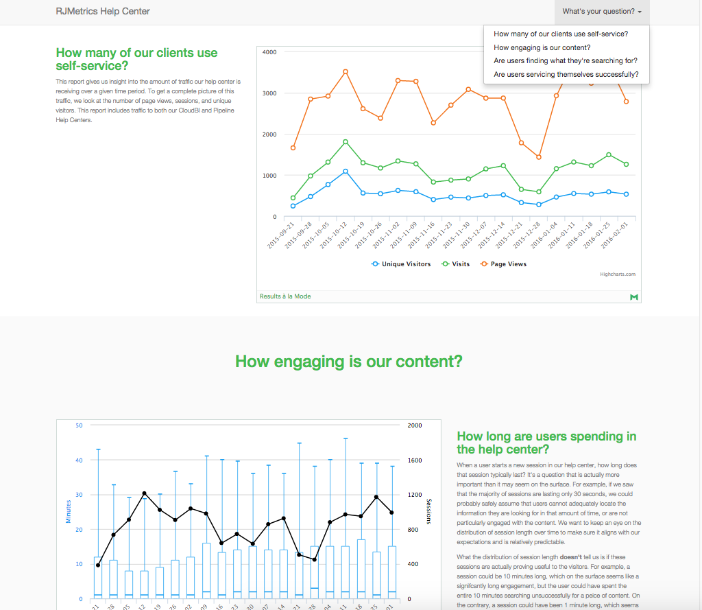
- How many of our clients are using self-service? One of my goals was to increase the number of client attempts at using self-service. To track this, we used some standard website metrics including the number of unique visitors, pageviews, and visits.
- Are our users servicing themselves successfully? This is probably the most important question on the list. Even if everything else looks healthy – high engagement rates, search clicks, and number of visitors – if a large number of users continue to submit tickets, alarms should sound.
Remember: the ticket queue will probably never be empty. Our goal was to reduce the number of certain types of tickets (e.g., user error) and volume overall while increasing self-service attempts.
Zendesk uses a metric called the Self-Service Score (SSS) to measure the success of their self-service offerings. The SSS is a ratio that looks at the total number of unique visitors of help content compared to the total number of unique users in tickets. The Zendesk Benchmark Report for Q2 2013 found that their customers’ average SSS was 4:1 – for every four people that visited the help center, only one filed a support ticket.
The SSS is the best measure we had to answer this question. To get our score, we built an analysis that divides the total number of unique visitors that interacted with help content by the total number of unique users in Zendesk tickets. We defined ‘content interaction’ as someone who did more than simply visit the help center’s landing page or go straight to the new ticket form. This allowed us to get a better idea of how many visitors were actually trying to self-serve versus those who were just popping in or only filing a ticket. - How engaging is our content? Tracking user engagement makes identifying areas for improvement easier. It also allows us to analyze how users move through the help center. For this, we drew inspiration from Snowplow’s cookbook and used standard web engagement metrics:
Using these metrics, we crafted analyses that showed us how long users spent in the help center, what content attracted the most visitors, how much of each article was being read, and if that content was referenced more than once. - Are users finding what they’re searching for? Search health ties into increasing engagement and self-service success, as users who utilize search are engaged and attempting to serve themselves. To answer this question, I wanted to know how many people were using the search feature and how many of those searches resulted in a click-through.
However, I realized that measuring usage and clicks only told me half of what I wanted to know. To get the full picture, we also had to know what users were searching for. And thus, a top search terms analysis was added.
Step 3: Getting the data
Now I knew what questions I wanted to answer. The next step was getting my hands on the data needed to answer them. I needed two data sources for this analysis:
- Snowplow – collects all of our web data
- Zendesk – contains all of our customer support data
Most of the analysis outlined above is single-source analysis, with the exception of the Self-Service Score. To calculate that, we needed to be able to write a SQL query that would join Snowplow data to Zendesk data. Snowplow replicates web data to Amazon Redshift, then we used our product, RJMetrics Pipeline, to stream our Zendesk data into Redshift. With all our data in a central data warehouse, doing cross-domain analysis became very straightforward.
Step 4: Building our reporting dashboard
For this step, we chose Mode. Mode has a pre-built integration with Amazon Redshift so we just connected to our data warehouse and were ready to start writing queries. Here’s a rough sketch of how our analytics stack for this project looks:
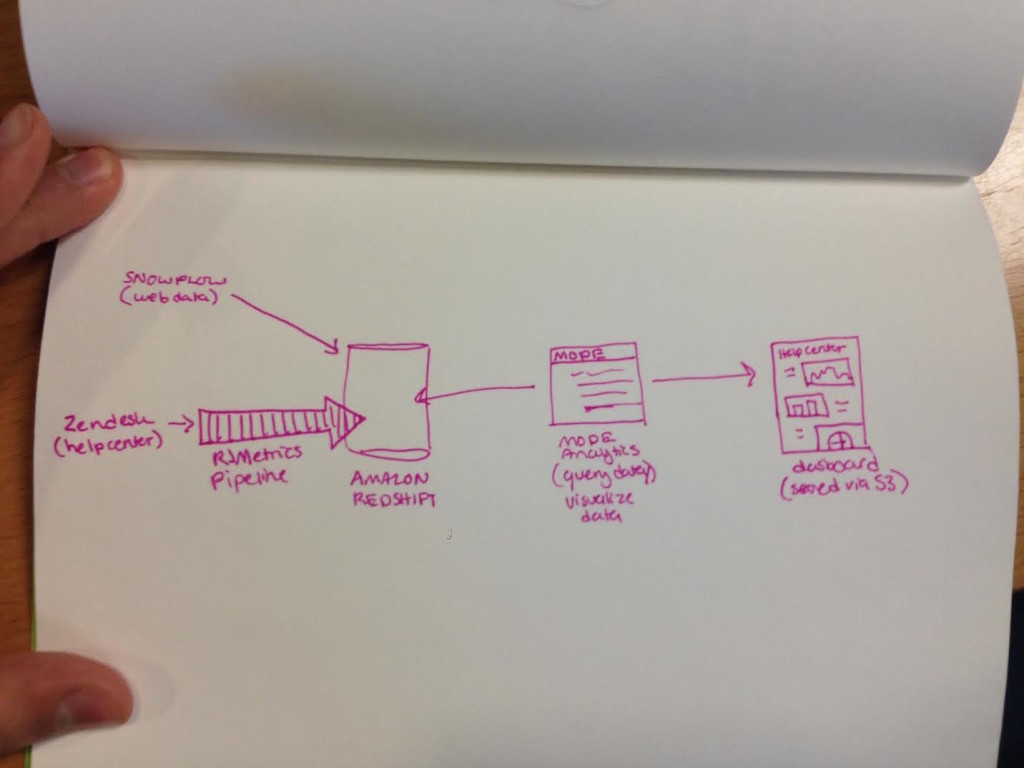
If you want to do this same analysis on your own help center, you can find most of these SQL queries in Snowplow’s cookbooks. The toughest query is one that joins Snowplow data with Zendesk data to calculate your Self-Service score. If you want a shortcut, here’s the exact SQL query we used to calculate this score.
We serve up the reports on S3 and designed the dashboard navigation based on the four questions covered in the previous section. Clicking a question in the dropdown takes you to a section with reports that help answer that question. Pretty nifty:
Step 5: Taking action on this analysis
The help center dashboard gives me a solid picture of how our content is performing and how that performance impacts RJMetrics’ support load. In the short time since we created the dashboard, we’ve done some pretty awesome things.
- We get new ideas for content from top search terms.Looking at our top search terms gives us insight into what our users are looking for when they come to the help center. Analyzing our search terms gave us ideas for new content, such as our Replicating Google Analytics channels using acquisition sources and Standardizing data with mapping tables articles.
- We easily identify unpopular and unhelpful content.
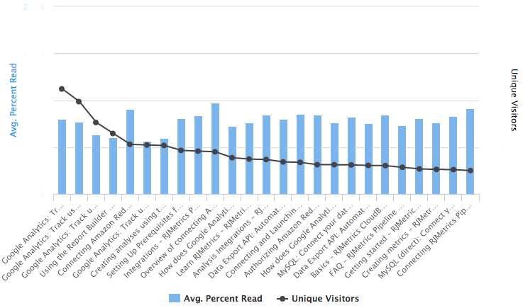
Our analysis for average percent read makes it easy for me to keep tabs on content that’s potentially unhelpful or obsolete. Not every article with a low average will be either or both of these things, but it’s an indicator for possible improvements.
For example: our FAQ had a low read average and despite answers being available, we still received a lot of tickets on those topics. This suggested that answers weren’t easy to find, so I took the original article and turned it into an entire FAQ section, browsable by topic and question.
These insights have enabled me to better manage our help content and create a better experience for our users. I’m always looking for ways to improve and tweak the help center, to fine-tune it to (near) perfection – which is why there’s still a bit more I want to do with the dashboard.
Step 6: Making ongoing improvements
We’re still debating how to define some of the metrics we’re using and if we need to build additional analyses. Here’s a brief look at a few items we’re currently working out:
- Should we exclude certain ticket types from our total ticket count? Quite a few of the support tickets we receive arise from product limitations – for example, certain types of calculated columns that only our analysts can build. These tickets would be filed even if users visited relevant help content, so should they be counted in the ticket total?
- How should we define unique visitors? On its face, a unique visitor is just that – a visitor that’s unique. In the SSS analysis, count only unique visitors that made an attempt to service themselves. This means we don’t include visitors that only visited the main page or went directly to the new ticket form. We don’t currently have a universal definition for this metric across our reports, as we’re still debating on how to define a unique visitor that views help content.
- Is our search reporting robust enough? As of now, we have reports for average search result click-through rate, top search terms, and how often search functionality is used. At this moment, I’m inclined to say no – we have a good idea of what successful terms look like, but not much for unsuccessful terms. An analysis of search terms with zero results would give us a better look at our search health.
- Are there any blind spots? While the dashboard gives me the ability to make data-driven decisions about our content, there are additional analyses that would help us work smarter.
Consider the analysis that looks at the average percent of articles our users read:
What happens after these users leave the article? Do they continue to browse the help center or do they leave? Do they submit a support ticket? If we were to look at a user session path analysis alongside this, we could potentially identify problem articles – articles with a low read percentage that then resulted in a support ticket, for example – and reassess the content.
At the beginning of this post, I mentioned that there’s a woeful lack of reporting on help center content. If you provide any kind of self-service support to your customers, keeping an eye on the performance of the content you surface is just as important as how support requests are managed. Treat your help center as an investment: the thought and effort you put into it will reap bigger returns if consistently nurtured. Creating a comprehensive reporting environment is a great way to monitor and fine-tune that investment.
How are you measuring the success of your help center? Tell me more in the comments!
