Here at RJMetrics, we work hard to create a great user experience and provide our customers with easy access to their data. We keep in constant contact with our customers to identify new opportunities to enhance our product.
We’re proud to say that our users have been creating new dashboards at a rapid pace! This is often caused by access to multiple data sources (backend databases, Google Analytics, Twitter, etc) or by users who have access to data from multiple companies (investors, advisors, etc).
To manage the high number of dashboards that some users generate, we enhanced our dashboard menu system to save our clients even more valuable time.
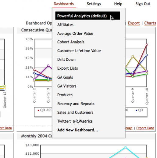
The Old System
Traditionally, all dashboards appeared under the main “Dashboards” menu in the top-right of RJMetrics.
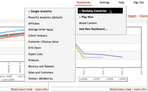
The New System
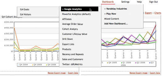
Now, dashboards are automatically organized into subcategories based on the company whose data they contain and the source of that data.
The screenshots below are for a user who has access to data from two companies: Vandelay Industries and Play Now. Under the enhanced dashboard menu system, dashboards associated with Vandelay Industries’ data is automatically filed under the Vandelay Industries subcategory. The same is true for Play Now data. Dashboards with data from multiple companies (like the “Mixed Content” dashboard seen below) appear in the first level of the menu.
Dashboards built using data aggregated from Google Analytics’ or Twitter’s API are automatically filed under the corresponding data source.
If you’re interested in learning more about RJMetrics, check out our website where you can learn more and try out a free demo.


