If you don’t already store marketing acquisition source information in your database, take a look at my colleague Chris’ blog post on how to track user acquisition source data.
With RJMetrics, it is easy to segment your revenue and users by referral source. Source can correspond to Google Analytics’s utm fields, or your custom data fields. This will allow you to find your best performing channels. We all have limited marketing budgets, so let’s invest it wisely.
In this blog, we will explore some of the reports that will help you uncover your most valuable marketing channels.
I. The “New users by sources” report shows you the number of newly registered users over time by different acquisition sources. This allows you to track the performance of referral sources in acquiring new registered users.
How to create this report in RJMetrics’ chart wizard:
- Initiate the chart creation process through Charts -> Create Chart.
- Choose the “New users” metric or an equivalent metric that counts the number of new users over time.
- Now set the Time Period of analysis to your user registration period of choice, and set the Interval to monthly.
- Go to the “Group by” tab to segment by “user’s acquisition source” and select a few sources or all sources.
- You can change the chart to a column chart using the icons found on top-right of the preview.
II. The “Lifetime revenue cohorts – user source” report shows the revenue over time limited to a specific user acquisition source. This allows you to see whether users acquired from a particular source spend more with you over their lifetime than another group of users.
You can replicate this report for many user referral sources and compare them side by side to discover which source generates the highest lifetime revenue fastest.
How to create this report in RJMetrics’ cohort chart wizard:
- Initiate the chart creation process through Charts -> Create Chart.
- Choose the “Revenue” metric. (Other metrics that make sense to look at from a cohort perspective include “Number of orders”, “Distinct buyers”, or “Average order value”)
- Choose to “Perform Cohort Analysis” under the selected Metric.
- Set the Cohort Date to “User’s creation date” or “User’s first order date”. Note that this is the date used to create the cohort groups (e.g. all users that registered or made a first purchase within a time interval).
- Set the Interval, Time Period and Duration accordingly.
- Add a filter under “Filter by” for “User’s acquisition source = X” to only include users from the channel “X”.
- Set the perspective to “cumulative average value per cohort member,” which will divide the cumulative revenue by the number of people in each cohort to return average lifetime revenue per cohort member.
(Shortcut: You may also Save As an existing lifetime revenue cohort chart and add a filter for acquisition source in the new chart)
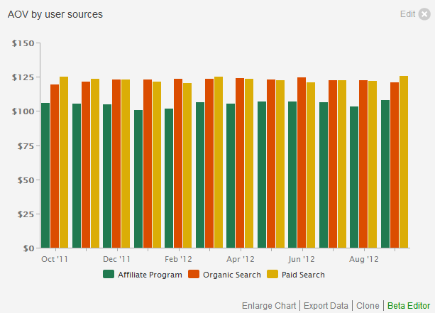
III. The “AOV by user sources” report shows the average order value over time segmented by user sources. This allows you to track whether users acquired from a particular source spend more per order than another group.

How to create this report in RJMetrics’ chart wizard:
- Initiate the chart creation process through Charts -> Create Chart.
- Choose the “Average order value” metric
- Now set the Time Period of analysis to your user registration period of choice, and set the Time Interval to monthly.
- Go to the “Group by” tab to segment by “user’s acquisition source” and select a few sources or all sources.
- You can change the chart to a column chart using the icons found on top-right of the preview.
IV. The “Revenue by user registration date and sources” report shows the total lifetime revenue over user registration time, segmented by acquisition sources. This allows you to identify whether users that registered during a particular time and from a particular source generate more or less of your overall revenue.
How to create this report in RJMetrics’ chart wizard:
- Initiate the chart creation process through Charts -> Create Chart.
- Choose the “revenue by user registration date” metric. Note that you may have to create this as a new metric by replicating the “Revenue” metric’s settings and replace the “Order date” with “User’s creation date” as time stamp.
- Now set the Time Period of analysis to your user registration period of choice, and set the Time Interval to monthly.
- Go to the “Group by” tab to segment by “user’s acquisition source” and select a few sources or all sources.
- You can change the chart to a column chart using the icons found on top-right of the preview.
V. The “Repeat orders by user sources” report shows the number of repeat orders over time segmented by user sources. This allows you to identify whether users from a particular source make more or less repeat purchases.
How to create this report in RJMetrics’ chart wizard:
- Initiate the chart creation process through Charts -> Create Chart.
- Choose the “Number of orders” metric.
- Now set the Time Period of analysis to your user registration period of choice, and set the Time Interval to monthly.
- Under the “Filter by” tab, add a filter for “User’s order number ‘greater than’ 1” to only account for repeat orders. The
User's order numberdimension calculates whether an order is the user’s first, second, third,… order. - Go to the “Group by” tab to segment by “user’s acquisition source” and select a few sources or all sources.
- You can change the chart to a column chart using the icons found on top-right of the preview.
If you need any help creating some of these reports or would like to perform even deeper analysis, simply contact us via “Support” -> “Contact Support” from your dashboard.
