Your business moves quickly, and we’re proud to build features that make sure your database analytics can keep up. Today, we’re happy to present the RJMetrics “Composite Chart Wizard,” an exciting new feature that allows you to create brilliant charts, graphs, and visualizations by combining data sets in countless new ways. We’ll explore composite charts in a number of future posts, and today we’ll start with a basic introduction to using composite charts to perform operations on related series of data.
The core functionality of the composite chart editor is the ability to display trends from distinct data sets on a single chart, and perform mathematical operations using the data contained in those series. Let’s apply this technique to our Vandelay Industries dataset.
Imagine that you’re the CEO of Vandelay Industries, a leading online apparel retailer. Your business is expanding rapidly and gaining affiliates, and you’re interested in looking at how revenue from affiliates is growing as compared to revenue from other channels. There are a number of good ways to get insight into this relationship, but one helpful view might be to look at percentage growth rates of affiliate and non-affiliate sales side-by-side in the same chart.
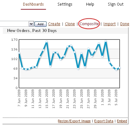
Building separate charts that contain the percentage growth rates of affiliate and non-affiliate sales is easy thanks to our traditional Chart Creation Wizard and Percentage Growth Perspectives. Let’s assume we’ve already created these charts and they exist in our chart list. To build a composite chart, we simply click “Add Chart” and follow the “Composite” link from any dashboard to begin creating our new composite chart.
Click this link from any dashboard to get started
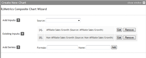
Clicking the “Composite” link presents us with the simple, two-step Composite Chart Wizard. Our first task is to identify the “source charts” that will serve as inputs to our composite chart.
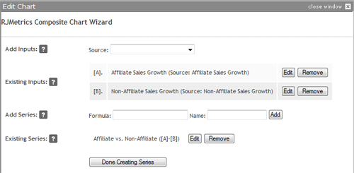
We know that we’ll be using the “Affiliate Sales Growth” and “Non-Affiliate Sales Growth” charts as our inputs. We select each of them from the drop-down and click “Add.” The two charts are assigned the labels [A] and [B], respectively, as shown below.
Select the inputs to your composite chart
Note that, after we add our first input chart, the list of available sources is restricted to only those charts that contain scalar values or have matching x-axis values to input [A] (in this case, a specific date range by quarter). This makes it easy to find the chart we’re looking for and prevents us from performing nonsensical operations.
Next, we will create the “series” for this composite chart. You can think of a series as an individual line on a multi-line chart. You can have one or more series in total, and the chart wizard will use the series you create to automatically detect the best chart type options later on.
Each series you add has two attributes: a name and a formula. The formula can include any basic mathematical operation (addition, subtraction, multiplication, or division) performed on instances of your input charts. For example, if you wanted to view the square of input [A], you would create a series with the formula [A]*[A]. There is no limit to the number of operations you can perform within a formula, and you can use parentheses to force a preferred order of operations.
If your formula contains different series, the operations are performed on series elements with matching categories. For example, if [A] and [B] contained monthly data for 2008, [A]*[B] would yield a series of monthly data for 2008 where the first element would be the product of the January 2008 values from each series, and so on. If [B] were a scalar value, that value would simply be multiplied by each value in [A] to yield the resulting series.
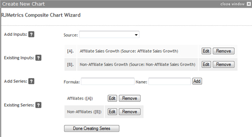
In the case of our growth comparison chart, however, we’ll simply be looking at the original data side-by-side, so our two series will have the basic formulas “[A]” and “[B]” respectively:
Build your series using custom formulas
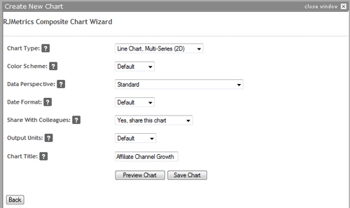
When we’re all done, we press “Done Creating Series” to move on to step two of the wizard. This step should look familiar because it’s almost identical to step five of the regular chart creation wizard. Here, you choose the desired chart type (line, bar, etc), a color scheme, and other finishing options. Depending on the data you have included, you may see more advanced options, as well.
Finalize your chart with these familiar options
Finally, we save our chart and click “Add to Dashboard.” Here is our result:
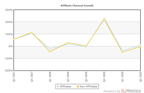
Two series on the same chart
It looks like the two series are very tightly tied to one another, so much so that this particular chart doesn’t provide too much value. To get a better look at what’s going on here quarter-to-quarter, let’s go back and edit the composite chart by mousing over its title bar and clicking “Edit.”
Clicking back to step 1, let’s delete our existing series and instead create a new series called Affiliate vs. Non-Affiliate and make its formula equal to “[A]-[B]“:
A better method
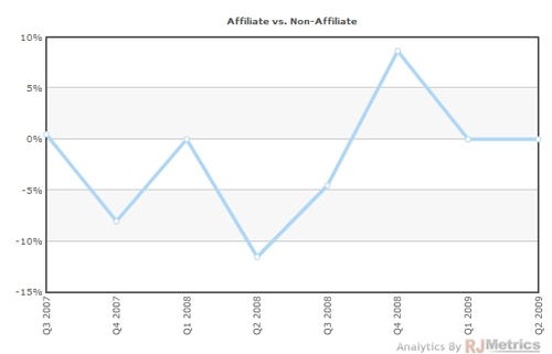
This formula will now show us the gap between the two lines we saw in our first composite chart. We click “Save” and view our results:
A more clear perspective
This is a much better way of looking at the data. It’s now clear that, prior to Q4 of 2008, affiliate sales were averaging a slightly slower percentage growth rate than non-affiliate sales. However, that trend seems to have reversed in more recent quarters. We could use familiar methods to easily view this same data by month, week, or even day to get a more granular perspective.
Composite charts allow you to generate new metrics to help better understand your business’ growth. We hope this example helped provide some insight into how they can be used. Tune in next time to learn how composite charts can be used to compound scalar data points into more useful series.

