Pinterest is the hottest young site on the internet. In the past six months, the social sharing tool has gone from effectively non-existent to one of the top 100 sites on the web (and is on track to break into Alexa’s Top 50).
Pinterest’s traffic charts aren’t hockey sticks– they’re rocket ships. In our experience, when traffic is growing that sharply there is often something even more amazing going on under the hood. We wanted to see if the usage and engagement numbers for Pinterest were as remarkable as its traffic and gain insights into exactly what was driving growth. Unfortunately, the company has kept very quiet when it comes to its data.
Tired of waiting, we took things into our own hands using some clever scripting and our secret sauce for analytics: RJMetrics. A full report is below, but here a few highlights from our findings:
- Pinterest is retaining and engaging users as much as 2-3x as efficiently as Twitter was at a similar time in its history.
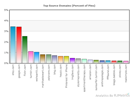
- Pins link to a tremendously large universe of sites. Etsy is the most popular source of pin content, but it only represents about 3% of pins.
- Over 80% of pins are re-pins, demonstrating the tremendous virality at work in the Pinterest community. To contrast, a study done at a similar time in Twitter’s history showed that only about 1.4% of tweets were retweets.
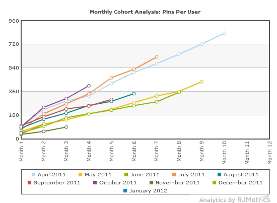
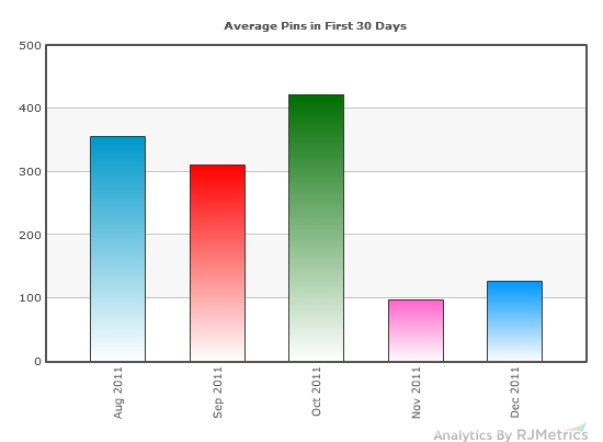
- The quality of the average new user (as defined by their level of engagement and likelihood to remain active) is high but declining. Users who have joined in recent months are 2-3x less active during their first month than the users that came before them.
How We Did It
We wrote some simple scripts to identify random users who joined at varying times in the company’s history and download their complete history of pins to conduct cohort analysis. We also pulled several hundred thousand additional pins from the general user population. All told, we ended up with a database of nearly one million pins.
Thanks to our old friend the central limit theorem, we’re confident that our sizable random samples are representative of the greater population they were pulled from. We should caveat, however, that there is always a risk of sampling bias. Since Pinterest doesn’t use auto-incrementing IDs, we had to get creative about identifying random users and pins. We identified user names based on common dictionary words and then expanded to general-population pins by guessing at ID numbers in numeric proximity to the pins of those core users.
We loaded this raw data into RJMetrics and were able to conduct the following analysis in about 15 minutes. If you’d like to give it a try with your own company’s data, RJMetrics is offering free 30-day trials for a limited time.
Content: What’s Being Pinned?
On Pinterest, every pin ties back to an external link. We used RJMetrics to extract the top-level domain of those links for the pins in our sample. What we found was a pretty tremendous long-tail effect. In our sample of about a million pins, over 100,000 distinct source domains existed. The twenty most prominent are shown below by percent of pins.
The most popular domain was Etsy.com, which powered just over 3% of pins. Close behind was google.com, although almost all Google links point to Google Image Search, which is technically misattributed content from other 3rd party domains. Flickr (2.5%), Tumblr (1.1%), and weheartit.com (1.0%) round out the top 5, after which no domain represents more 1% of pins.
Virality: Re-Pins and Tools
We were able to break out the population of pins based on how those pins were posted to Pinterest. We were expecting a high percentage from pinmarklet, a browser bookmarklet that allows users to pin content from any website with one click. However, what we found was astonishing.
Remarkably, over 80% of pins are re-pins. This is evidence of the impressive level of virality at work in the Pinterest community. Pinterest is truly an ecosystem of sharing. To contrast, a study done by Hubspot at a similar point in Twitter’s history showed that only about 1.4% of tweets were retweets.
User Engagement: Cohort Analysis
Cohort Analysis is a powerful tool that allows us to study different groups of users at identical points in time in their lifecycles, regardless of when they actually joined the site. It’s a great way of getting an “apples to apples” look at newer vs. older users to see how their engagement stacks up.
In the chart below, each line represents a cohort and each cohort is a group of customers who made their first pin in a specific month. For example, the June 2011 cohort consists of users who made their first pin in June 2011. The line itself shows the “average cumulative pins made per cohort member.” So, the “Month 1” data point for the June 2011 cohort shows us how many items were pinned in June 2011 by users who joined in June 2011. The “Month 2” data point on that same line shows us how many pins had been made by the average user in that cohort by the end of July 2011, and so on.
For most companies, even highly successful ones, cohort charts like these show lines that steadily decay toward a more horizontal slope over time. This happens because there is some natural attrition rate with which users simply stop using the site, causing the incremental engagement of the average user to drop off.
That is definitely not the case with Pinterest.
These lines show little to no decay whatsoever. Their slopes remain consistent, indicating a net attrition rate of close to 0%. This either means that no one who starts using Pinterest ever stops or– more likely– that users who continue to use Pinterest become so much more engaged over time that their activities fully make up for those of any users who leave.
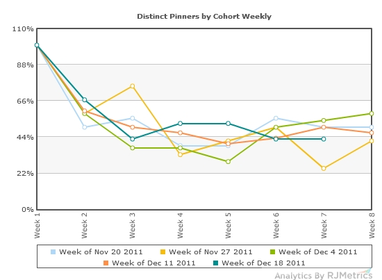
To explore which of these two scenarios is playing out, we changed a few options in RJMetrics and ran the cohort analysis below:
This weekly cohort analysis shows the percentage of distinct users from some recent cohorts who come back to pin again in each of the first 8 weeks of their life cycle. As you can see, between 40% and 60% of users are still actively pinning even as far out as week 8. This may seem like a steep drop-off, but for a consumer internet business it’s exceptionally good.
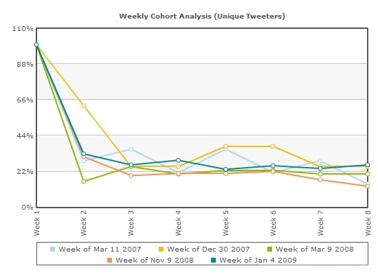
To provide some context, I want to compare this data to a similar analysis I conducted on Twitter in 2009. Twitter was at a similar point in its life cycle (growing tremendously and about a year into its existence). See the chart below:
Twitter’s decay rate was twice that of Pinterest, with user activity (measured by tweets) rapidly plummeting to around 20% before stabilizing.
Growing Pains: Quality Decay
With every fast-growing consumer startup I’ve profiled, an increase in media coverage inevitably corresponds to a huge spike in the number of registered users and a drop-off in the quality of the average user (as defined by their level of engagement and likelihood to remain active). Pinterest is no exception.
As shown above, the average new user who has joined Pinterest in the past few months is using the site substantially less than their counterparts from months in the past. I speculate that this is caused by flocks of curious onlookers who are outside of Pinterest’s core audience registering accounts and failing to get engaged. In the long-term, this could potentially represent a challenge to the company maintaining the remarkable engagement metrics we’ve seen so far.
Conclusion
Pinterest demonstrates some of the strongest user engagement, retention, and virality metrics I have ever seen in an online business. The company has found tremendous success among its core demographic, and the potential reach of its appeal will be tested in the coming months as attention from broader audiences continues to increase.
If the company’s performance to date is any indication, however, it will surely be a start-up to watch in 2012 and beyond.

