Our recent hackathons have yielded quite a few gems: a gong that rings itself, eCommerce benchmarks, a github-powered roadmapping tool, and countless product enhancements.
Last spring our designer, Zach, unveiled a hackathon project that would end up impacting our entire organization: a new visual identity. New colors, new fonts, and, most importantly, a new logo: the dodecahedron.
![]()
This rebranding came with a great origin story that fit well with our company’s mission and world view. After getting some positive feedback from colleagues, peers, friends, and family, we pulled the trigger.
In July, we launched a new website that incorporated the rebranding and celebrated.
A Brief Problem
A few weeks later, I saw the first tweet like this:
@RJMetrics Why is your logo a pair of Y Fronts?
— Stephen Johnstone (@stitges) September 3, 2013
I had never heard of Y-Fronts, so I wrote it off and scrolled right past. But they kept coming…
@RJMetrics just appeared as a promoted Tweet. Their logo looks like Y-fronts.
— Anthony Grimley (@antinbath) September 4, 2013
And coming…
@RJMetrics hi… is your logo supposed to look like a pair of 'Y' fronts??
— Richard Parry (@Pazzzer69) September 7, 2013
And coming…
@RJMetrics I've just noticed that your logo looks like a giant pair of orange Y-Fronts – Is that intentional?
— Michael Bolton (@MichaelBoltonA) September 11, 2013
“OK fine,” I thought. “I’ll bite.” I googled “y-fronts”…
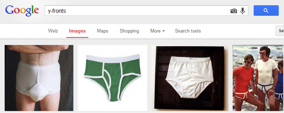
Uh-oh. Our promoted tweets were exposing the new logo to thousands of new people per day. And some percentage of them were seeing underpants. Bright orange tighty whities to be exact:
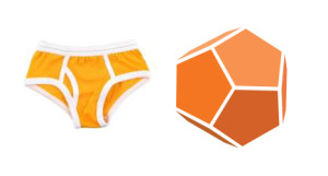
I kind of see it now, but it’s a bit of a stretch. The lingering question, though, is why no one on our team or in our pre-launch focus groups saw that. What is it about these tweeters that makes their mind jump to y-fronts? And, while I’m at it, who on earth uses the term y-fronts?
Getting to the Bottom of This
A quick look at the profiles of these tweeters showed a distinct pattern: London, Aylesbury, Gloucestershire, East Sussex… Without exception, every tweet that ever suggested that our logo looks like underpants had come from the United Kingdom.
Since we promote our tweets globally, it seemed odd that only people from the UK would make these comments. I needed more data, so I built two Google Consumer Surveys, one targeted at the US and another at the UK. They each asked a single question to 1,000 random participants:
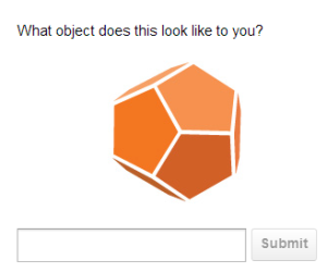
In both countries, the most popular response was “soccer ball” (which showed up as “football” in the UK, of course). “Dodecahedron” took second place in both countries (people really know their geometry!), followed by a laundry list of other geometric shapes.

The long tail of responses was quite long in both regions, but there was only one response that was substantially different between the two populations: y-fronts.
| US | UK | |
|---|---|---|
| Soccer Ball/Football | 28.9% | 35.7% |
| Geometric Shapes | 22.4% | 24.5% |
| Underwear/Y-Fronts | 0.2% | 2.6% |
Out of a thousand respondents in the US, only two of them saw underpants. In the UK, that number was 26. For what it’s worth, we could now say with 99.9% confidence that people in the UK are more likely to see underpants when they look at our logo than people from the US.
But Y?
We were faced with an interesting anthropological question: where does this difference come from? What is it about Brits that causes them to see underpants in our logo?
I read up on the history of y-fronts and called everyone I know who grew up in the UK. I walked away with a few anecdotes that seem to tell the story:
- The prominent upside-down “Y” made up by our logo’s edges is reminiscent of the same “y” from which y-fronts get their name.
- The white background of our Twitter logo makes these transparent edges look like elastic bands.
- The term “y-fronts” never caught on the US because American underwear maker Jockey convinced the buying public to use the term “Jockeys” instead.
- Y-fronts/briefs/etc are substantially more popular in the UK than the US
- UK schoolchildren sometimes tease each other with insults like “I bet you wear y-fronts.” One Englishman I spoke with suggested that this might etch y-fronts more deeply into the psyche of the British.
It appears that y-fronts are a uniquely British phenomenon whose popularity doesn’t extend far past their borders. When we were testing our new logo, our focus groups didn’t include a single Brit, causing us to miss this complication outright.
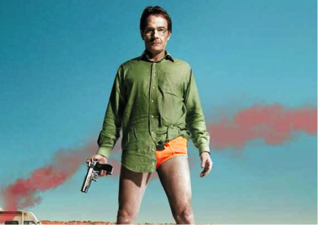
Professional Alterations
Our team quickly embraced the alter-ego of our logo as an inside joke—it’s now an unspoken rule that orange underwear is the secret uniform of RJMetrics enthusiasts…
(one of many Photoshop jobs posted to our company Yammer)
Unfortunately, this wasn’t the most desirable marketing situation. Among other things, we didn’t want potential customers to see an endless stream of underwear jokes when they searched for our Twitter handle.
Our graphics team proposed a simple fix: change the angle at which the dodecahedron is being viewed and shrink the white lines that separate its edges so they look less like elastic bands. The result:
![]()
We launched another UK Google Consumer Survey with these changes. The results allowed us to breathe a sigh of relief: out of 1,000 respondents, only 4 saw y-fronts or underwear.
As an added bonus, geometric shapes actually overtook “football” as the top answer. Over half of respondents saw some kind of geometric shape, with dodecahedron/dodecagon as the most popular answer. Not only had our logo revision eliminated the y-fronts issue, it had actually increased recognition of the actual shape!
The Ending
Here are a few lessons I’m taking away from this experience:
- Running a business with an international audience means internationally testing all new imagery and terminology.
- Success brings visibility. Thousands of new people are exposed to our business every month, and strangers will not be shy about pointing out mistakes.
- Hackathons are an amazing resource for kick-starting new ideas and proving out concepts. However, they should never be used to circumvent due diligence on big business decisions.
- There is no excuse for not testing something as significant as a new logo on a large, global audience. Google Consumer Surveys made this possible with a few clicks.
I try to learn something new every day—this experience didn’t disappoint. I hope you learned something too.