Welcome to part two of our introduction to the RJMetrics “composite chart,” an exciting new tool that allows you to create live, interactive visualizations by combining datasets in unprecedented ways. In our last post, we performed transformative operations on related series with composite charts, and explained how this application can help you better understand your business’ growth. Today, we’ll use composite charts to merge scalar data points into series, allowing you to visualize and understand the relationships between disconnected datasets.
To illustrate this technique, let’s return to our Vandelay Industries dataset. Imagine that you’re the vice-president of sales for Vandelay Industries, and you’d like to see just how many purchases your most loyal customers have made. To do this, we’ll generate a pie chart showing the distribution of customers based on how many previous purchases they have made.
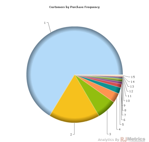
To begin, let’s generate a pie chart that sorts customers by purchase frequency. We’ll create a standard chart that tracks the “number of customers” trend, and examines the “number of orders placed” category. We end up with a chart like the one below:
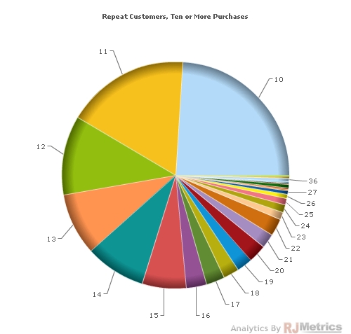
As you can see, customers with one purchase dominate this chart, making it difficult to follow the patterns of more loyal customers. Let’s try to work around this issue by adding a restriction. If we limit our visualization to display only customers with ten or more purchases, we generate the chart below:
While this chart is certainly an improvement over the first one, it still isn’t ideal. The customer groups are heavily fragmented (as you would expect at this level), causing us to lose track of buyers who have made more than twenty purchases. Instead of a pie chart sliced by each individual number of purchases, it would be preferable to generate a chart split into explicit ranges of values. We can use composite charts to achieve this visualization.
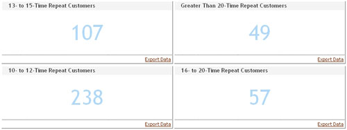
To do this, we simply generate scalar values that represent the number of customers who have made repeat purchases within our desired ranges. We can do this in seconds using the chart creation wizard and the “clone and edit” tool. We choose the ranges 10-12, 13-15, 16-20, and 20+ purchases. These four scalars are shown below:
This is good data but a poor method for displaying it. Using composite charts, we can now build a much better way of viewing this data.
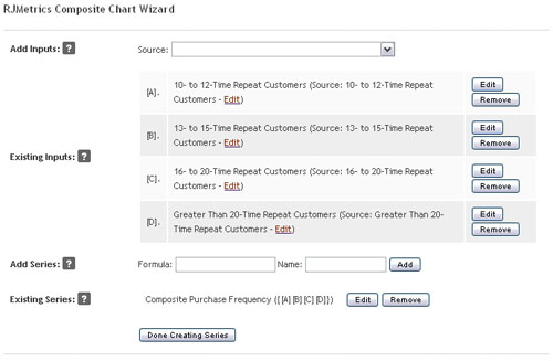
We click “add chart,” and choose “composite” to open the composite chart wizard. The source dropdown list adds inputs to the chart, and we use it to select the four scalar values we’ve just generated. They are assigned the variables [A], [B], [C], and [D]. With our inputs now selected, we can move on to series creation.
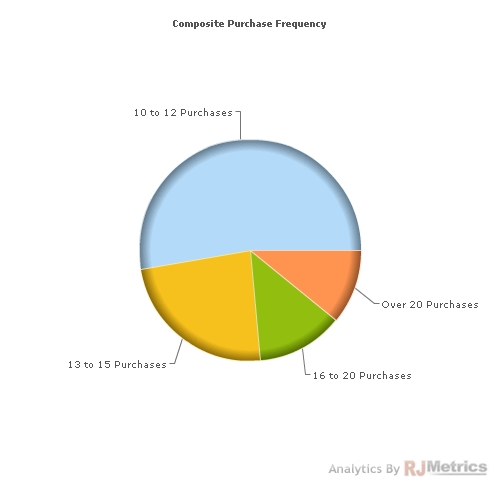
In the “add series” area, we can create a single-series chart from multiple scalar values by enclosing them in curly brackets: {[A][B][C][D]}. We name our new series “composite purchase frequency” and click “add.”
In step two, we select a pie chart as the chart type and customize any other aesthetic elements of interest. All the defaults are adequate in this case. We press “save chart” and viola:
The output is straightforward and stunning. We now have a useful visualization of the customer distribution among those who have made ten or more purchases. If we wanted to track absolute numbers in each category, we could simply change the output type to a bar chart. As the customer base grows and matures, of course, this chart will continue to dynamically update.
When used to consolidate scalar data, composite charts can illuminate convoluted and disparate datasets in a new way, leading to strong visualizations that can more efficiently inform decisions. This makes your business intelligence dashboard significantly more powerful and robust.
The composite chart is one of many features that can deliver smarter, richer, and better business analytics to drive your business’ growth. But don’t just take our word for it: try RJMetrics today.

